Project
Efix
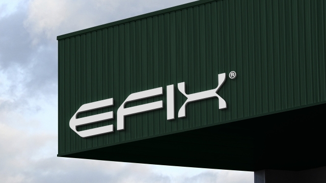
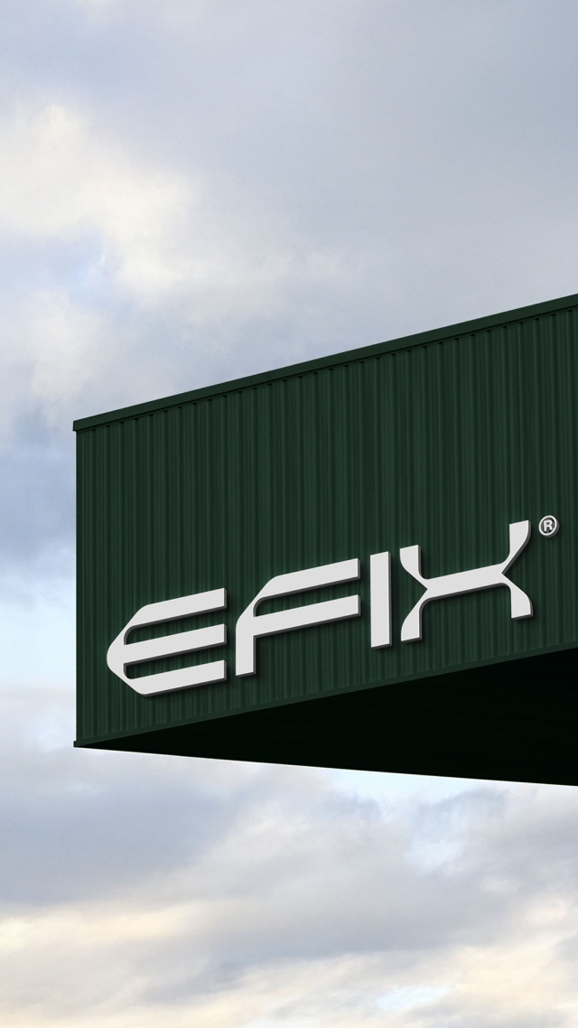
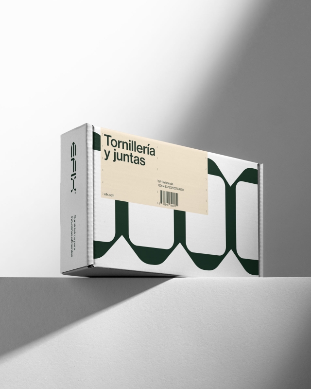
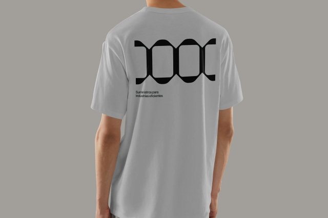
Idea Raising the tone of conversation in a sector as far removed from the world of design as industrial supplies. A generic product whose only unique feature is its quality requires tone. This project is just that: tone, technical tone. A hyper-technical brand with a look based on parallel and perpendicular lines, softened curved angles and extended typography in a short, powerful name.

ART DIRECTION
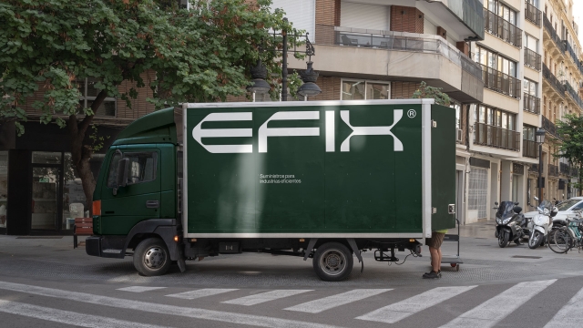
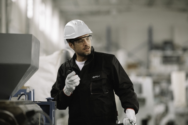
Raising the tone with technical and formalistic graphics is of little use if the content is noisy and disordered. Industrial product photography tends to be just that: a collection of ungainly metal shapes with proportions that are not conducive to visually appealing images. To solve this, we defined an art direction by working on the lighting, backgrounds and more restricted framing, where repetition helps us to compose images full of rhythm and harmony.
Credits
3D Render
Pablo Gázquez