Project
Vinos de Olivares
ClientBodegas Olivares
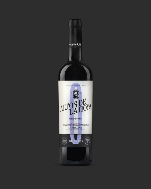
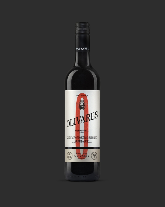
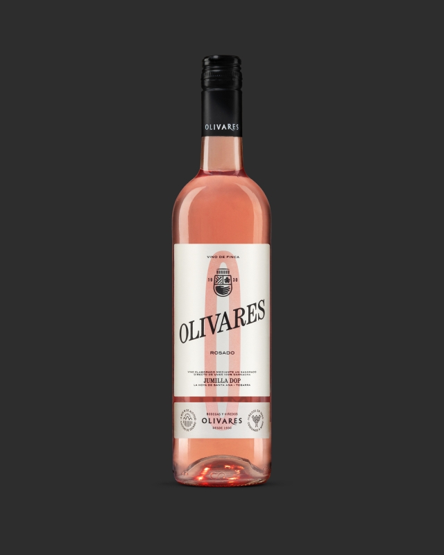
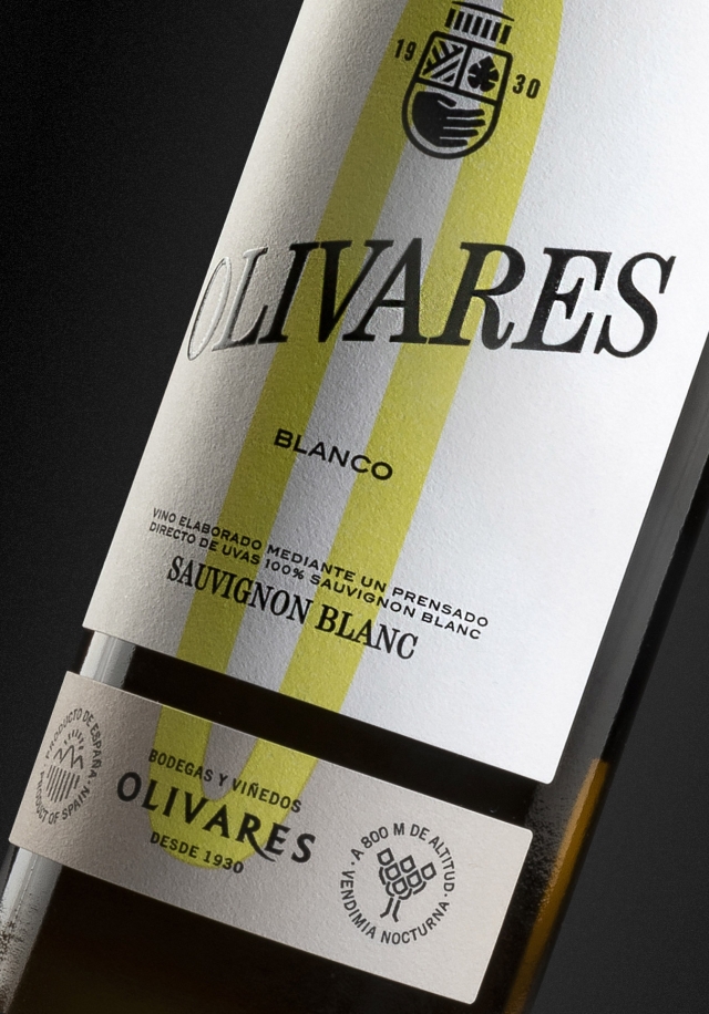
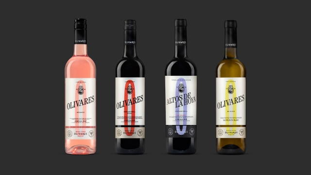
Idea Bodegas Olivares has been making wine since 1930. A wine born of time, of hands, and of an understanding of tradition that lives on today. There was no need to invent anything, just to transfer those values to a new collection of labels. A redesign that looks to the past without nostalgia and to the future without artifice. The O of Olivares becomes the common thread, the symbol that captures history and transforms it into a more timeless identity. A natural evolution that unifies White, Rosé, Red, and Altos de la Hoya under one voice.
OWN HERALDRY
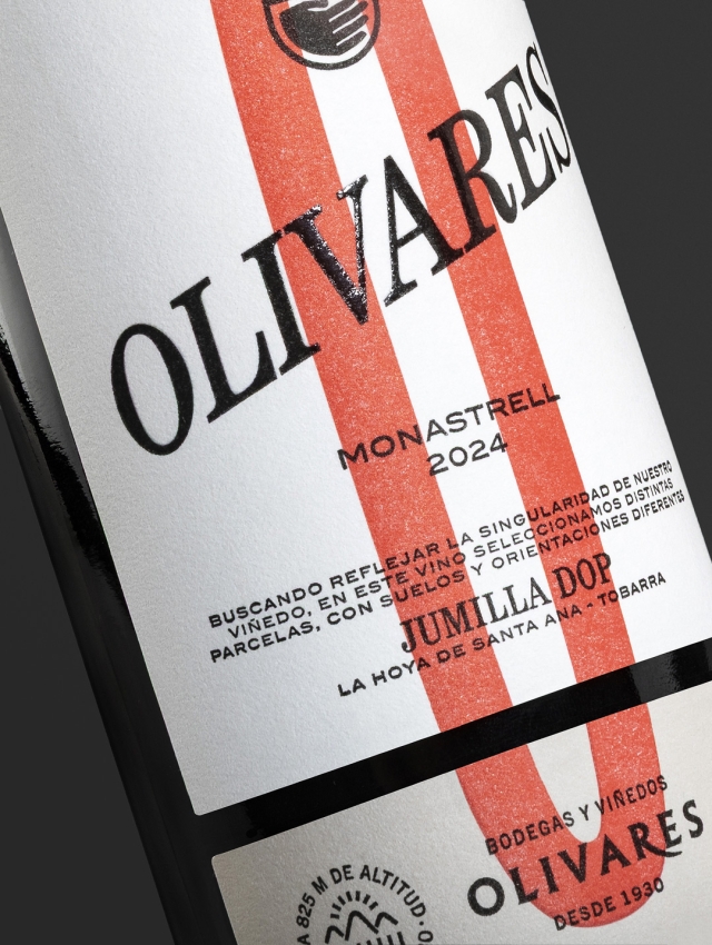
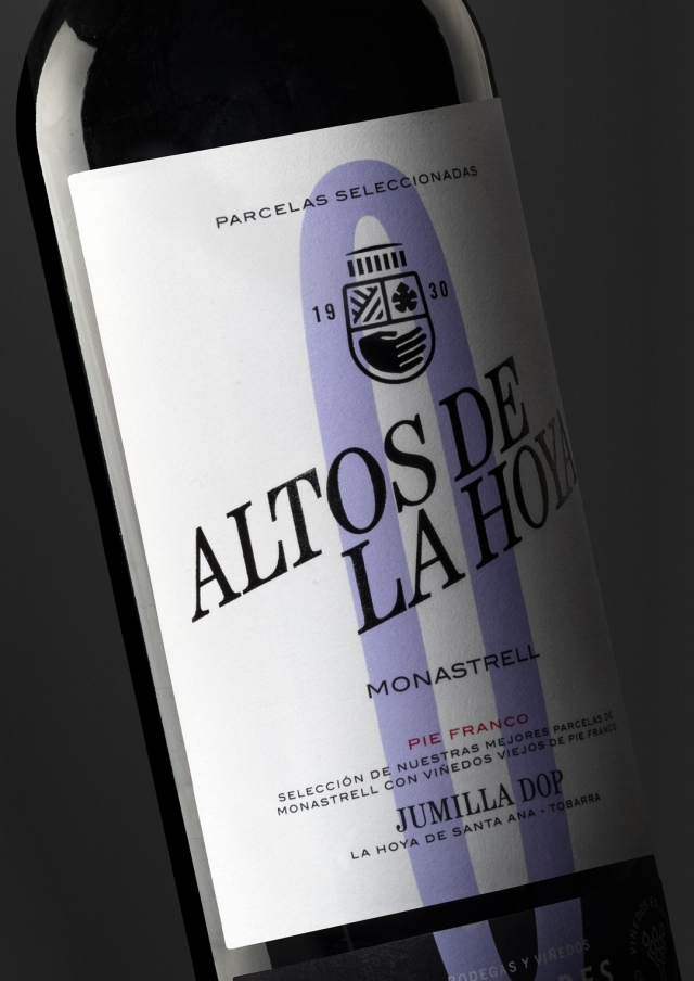
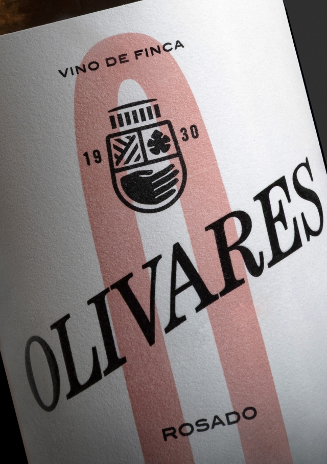
Almost a hundred years after founding a winery, we designed our own coat of arms. An emblem that brings together everything that defines Olivares: the hand that speaks of craftsmanship, the fields, the Monastrell leaf, the date of foundation and, as a crowning touch, the iconic façade of the winery. All synthesised in the form of a shield and a wine glass.
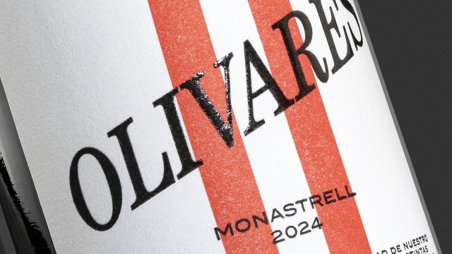
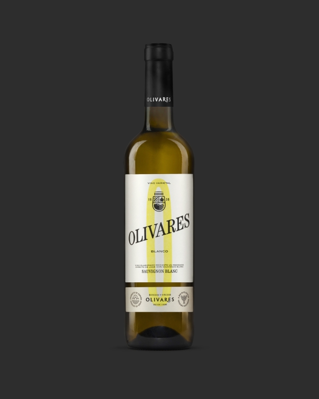
THE O FOR OLIVARES
On the labels, the O for Olivares acts as a visual thread that unifies the collection while allowing each wine to be differentiated by colour. A balance between tradition, authenticity and the timelessness of the contemporary.
Credits
PRODUCT PHOTOGRAPHY
Sergio Legaz