Project
Identidad Divendi
ClientDivendi
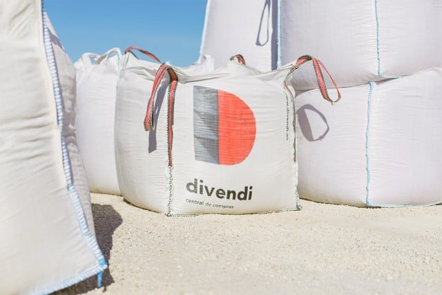
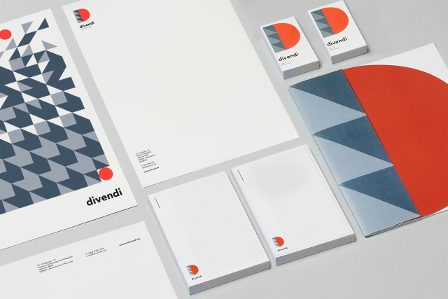
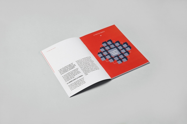
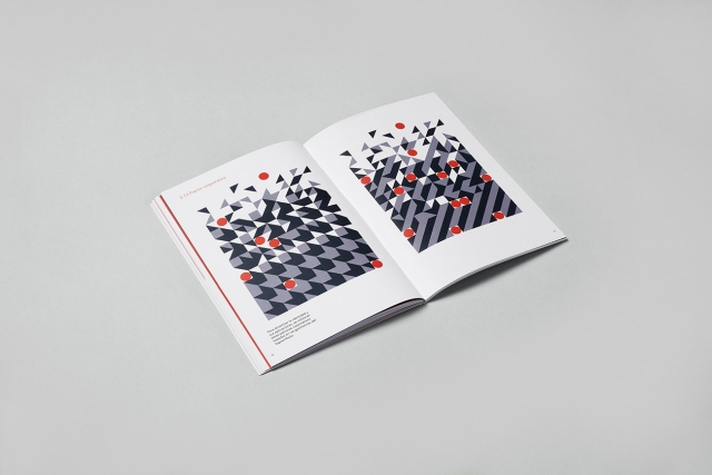
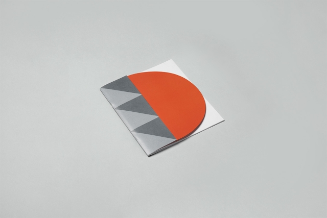
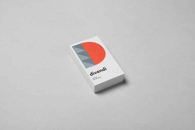
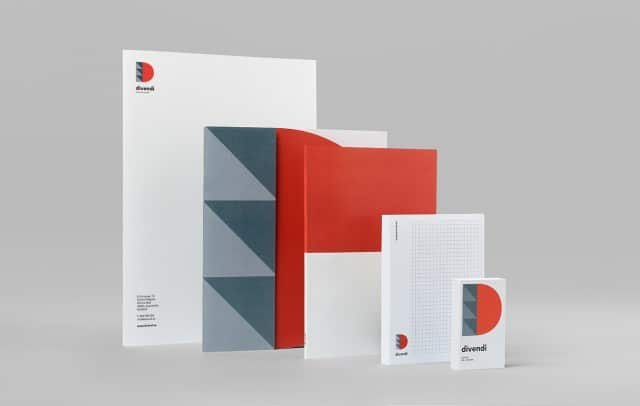
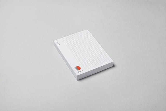
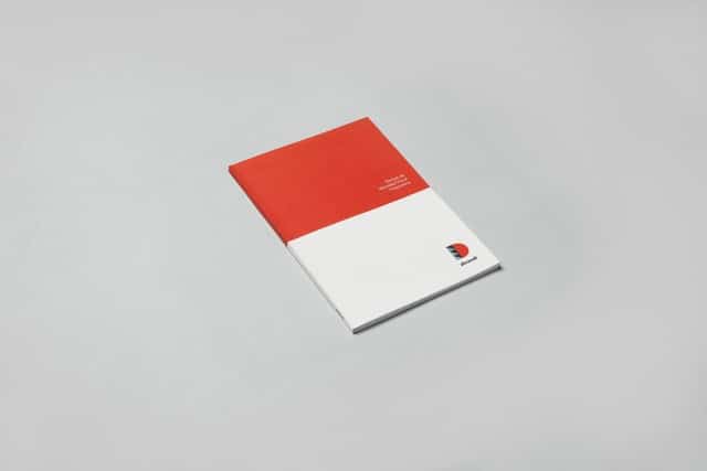
Idea The design of this corporate visual identity is based on the very fact of building. Divendi is a purchasing centre that was created in 2014 with the aim of bringing together small and medium-sized material warehouses in the construction sector. A triangle or a half sphere can be a small piece on its own but when we join several together we have a great brand as a result of this commitment between partners.
NAMING
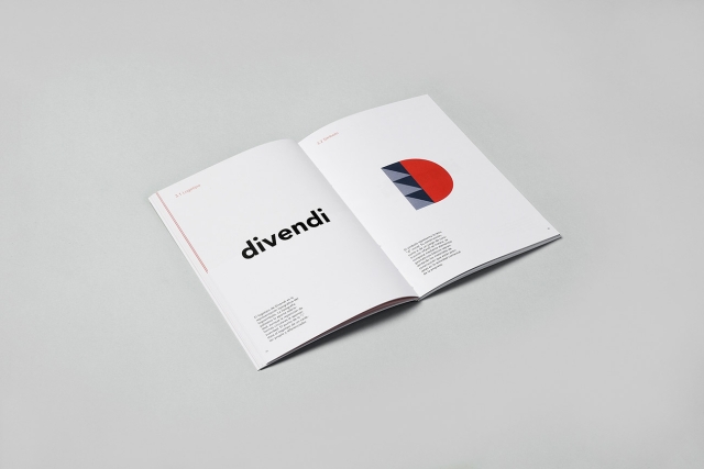
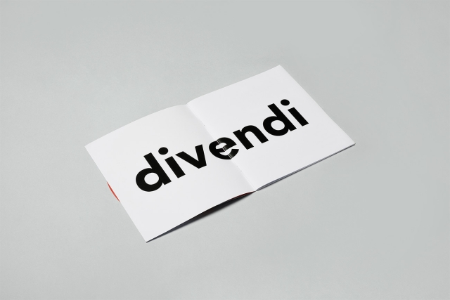
We took care of the development of the identity from the beginning. This naming is a simple play on syllables with no direct meaning. An invented word that raises certain links with the verb to sell, introducing the interlocutor into the field of the brand in a sympathetic way through the repetition of the phoneme ‘i’.
VENDER > DIVENDI
PACKAGING
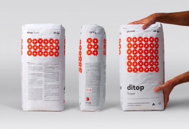
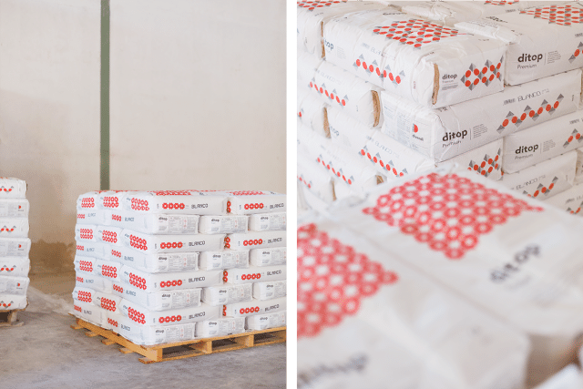
How to bring the brand to the product? This modular system allows us to easily adapt the brand to our own product ranges that reflect Divendi’s visual identity. With this idea we developed the complete range of 6 bags of cements and mortars that you can see here.
