Project
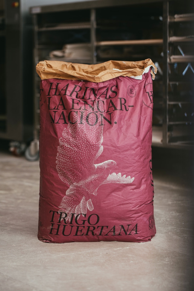
La Encarnación Flour
ClientHarinas La Encarnación
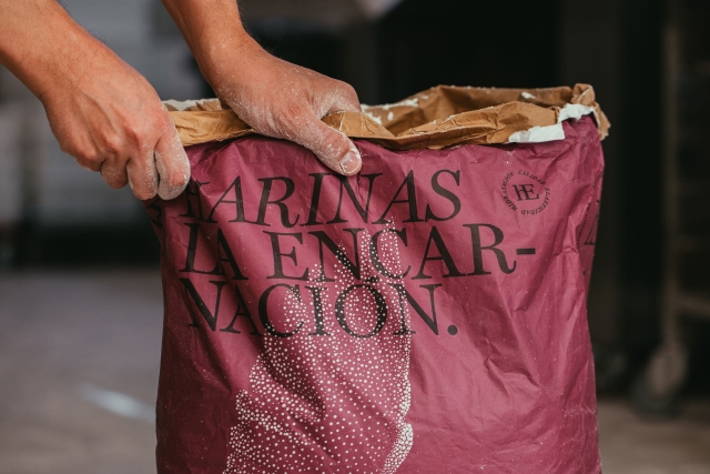
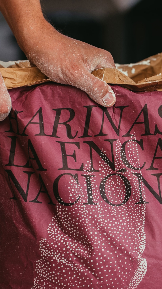
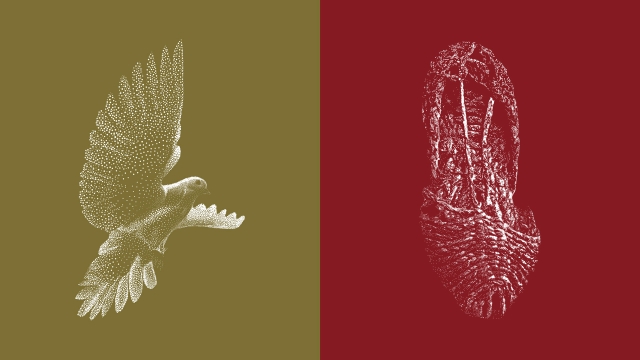
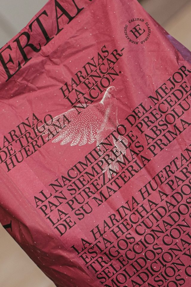
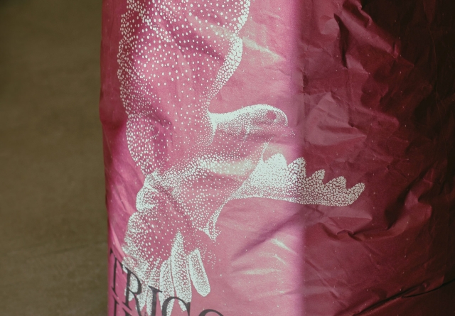
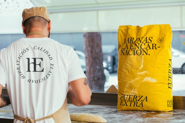
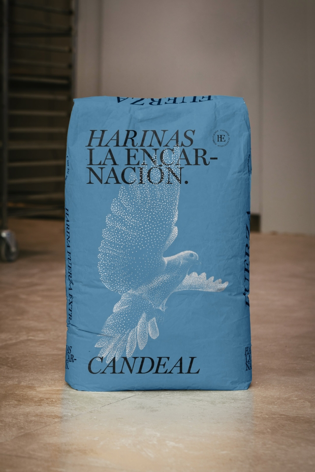
Idea A divinely inspired name turned into an illustration under the codes of the pointillism that flour offers us. A basic product worked from the simplicity of color, typography and illustration. A full range of products for industrial food area.

Laus Bronze in Mass Consumption Packaging
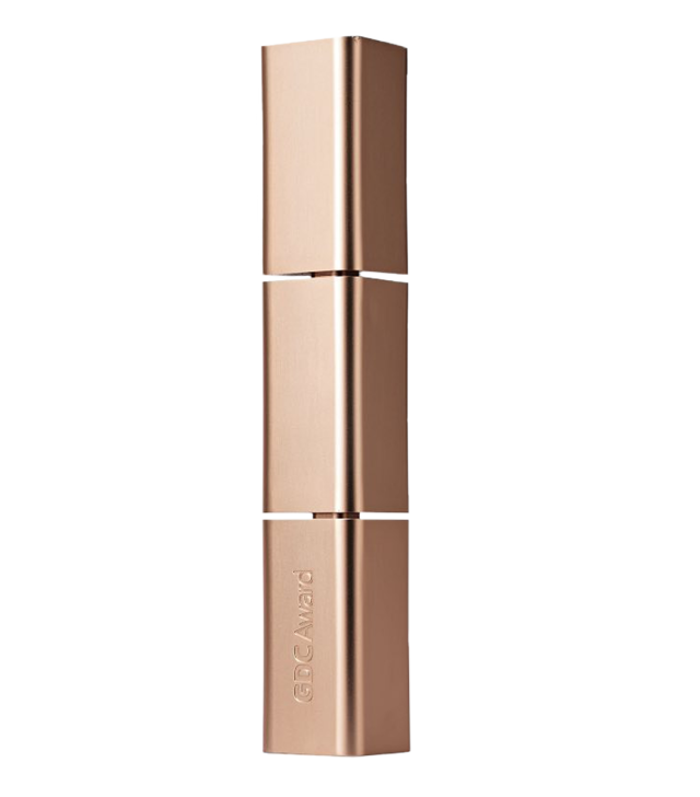
Bronze at GDC Awards (Shenzen, China)
Highlighted at The Brand Identity Blog
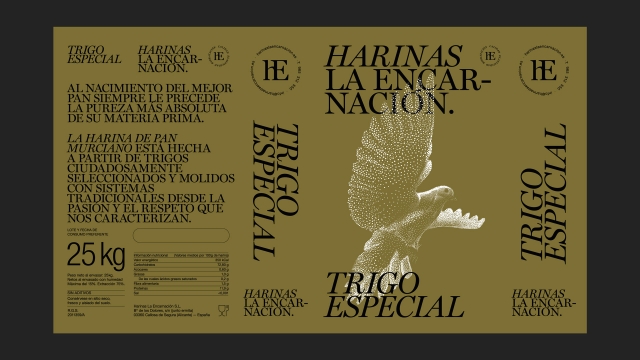
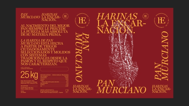
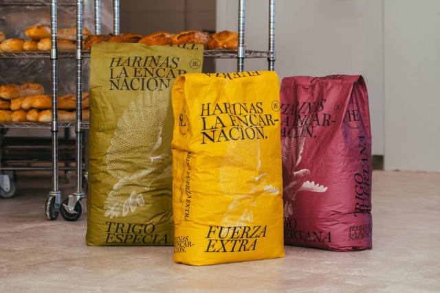
PRODUCT RANGE
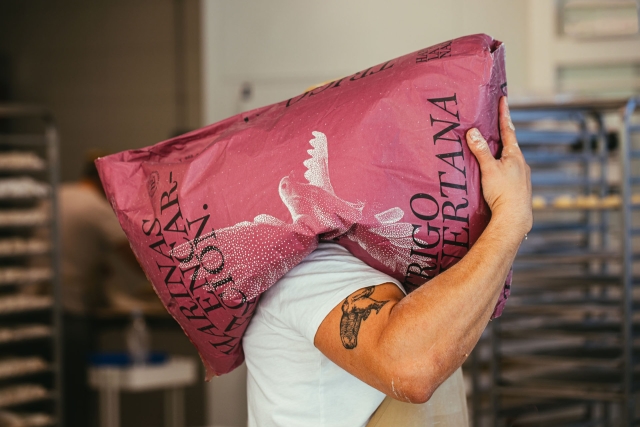
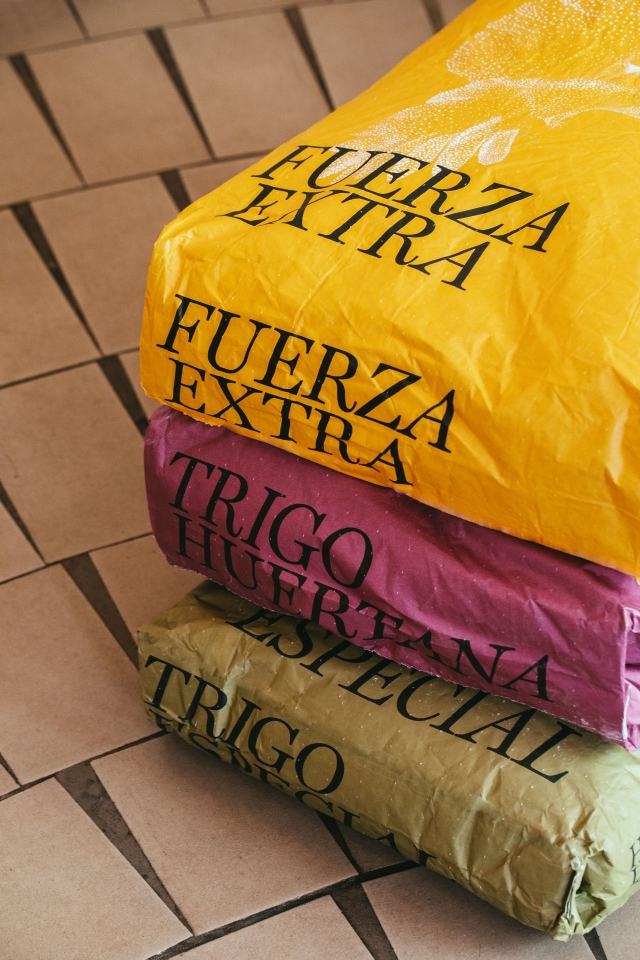
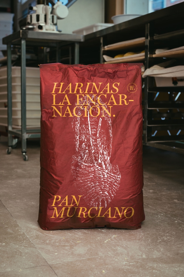
This project includes a wide range of products with more than a dozen references organised in a balanced color system that allows the product to be identified in the bakeries. Within this range we highlight a family of unique products where the illustration is linked to traditional aspects of the area where this type of flour is produced.
Credits
Photography
Cristina Navarro
Motion Graphics
Gallut