Project
Suarez Family
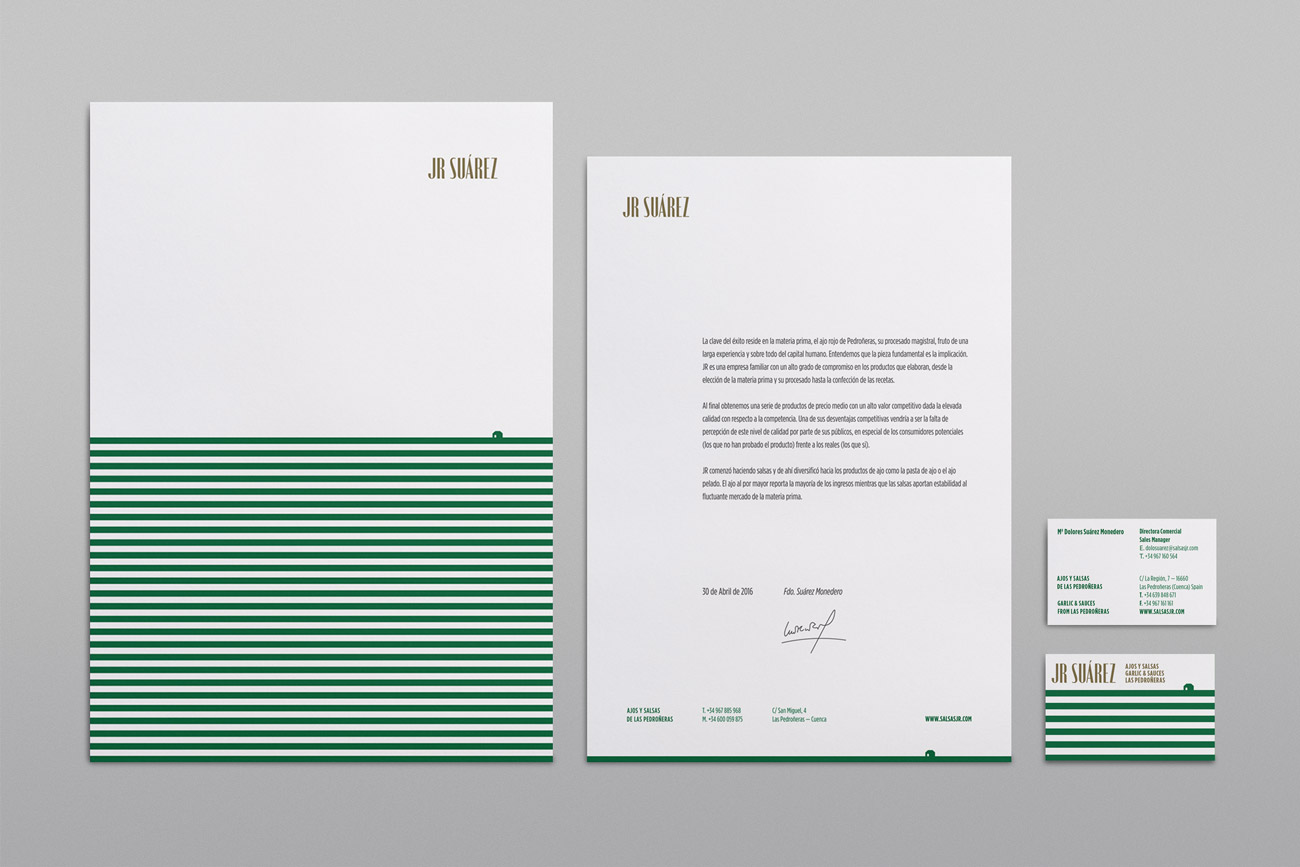
Client
JR Suárez
IDEA
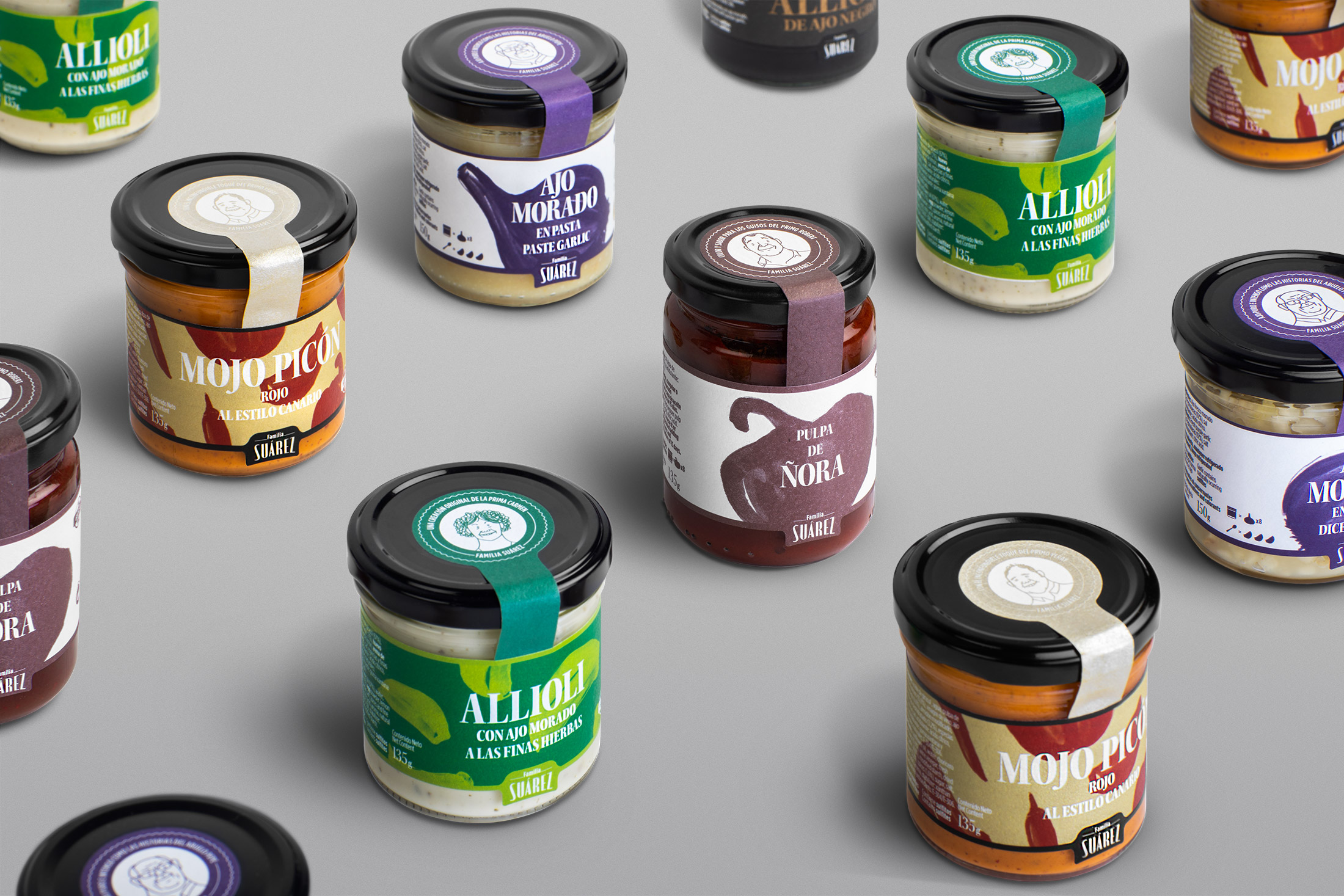
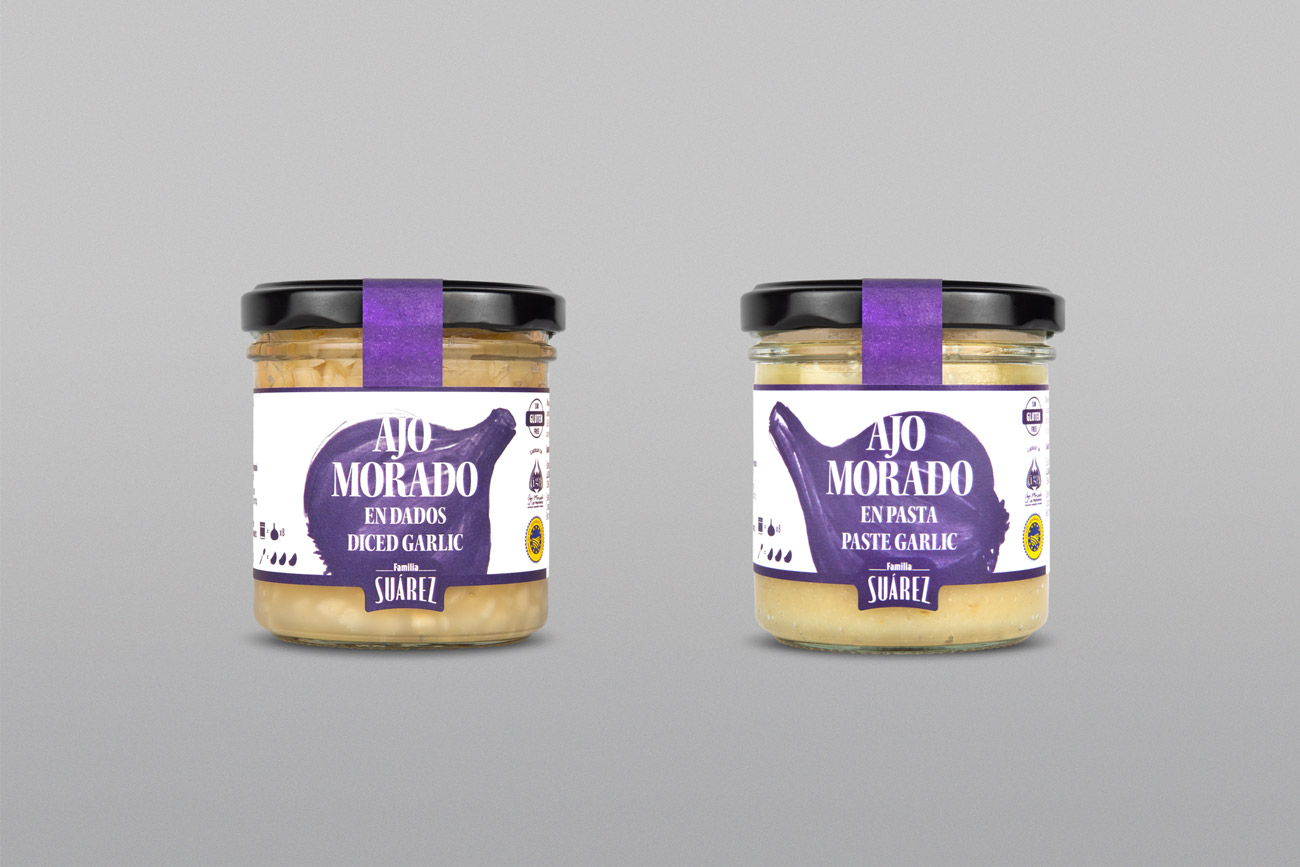
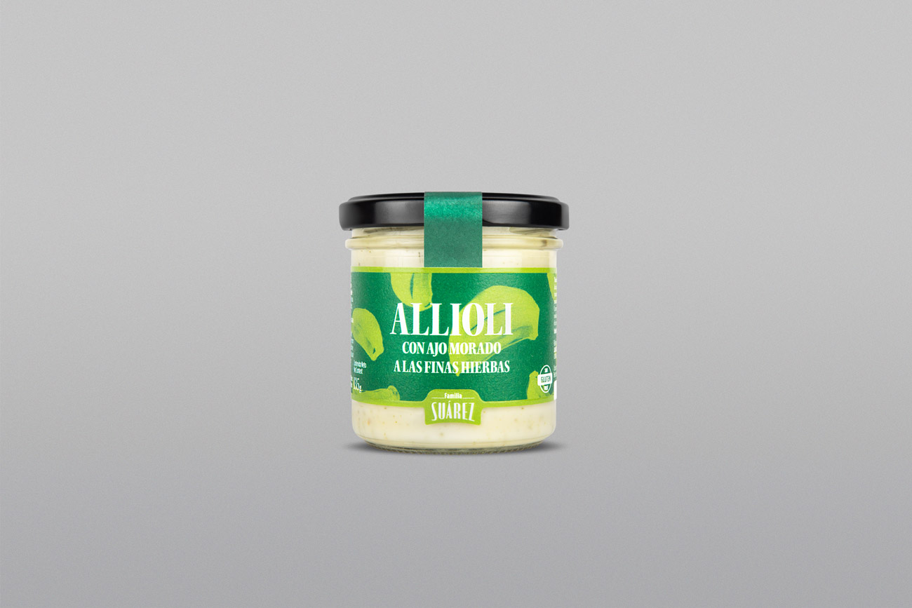
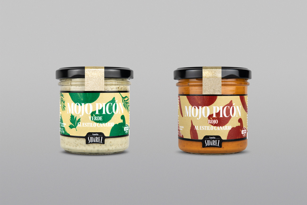
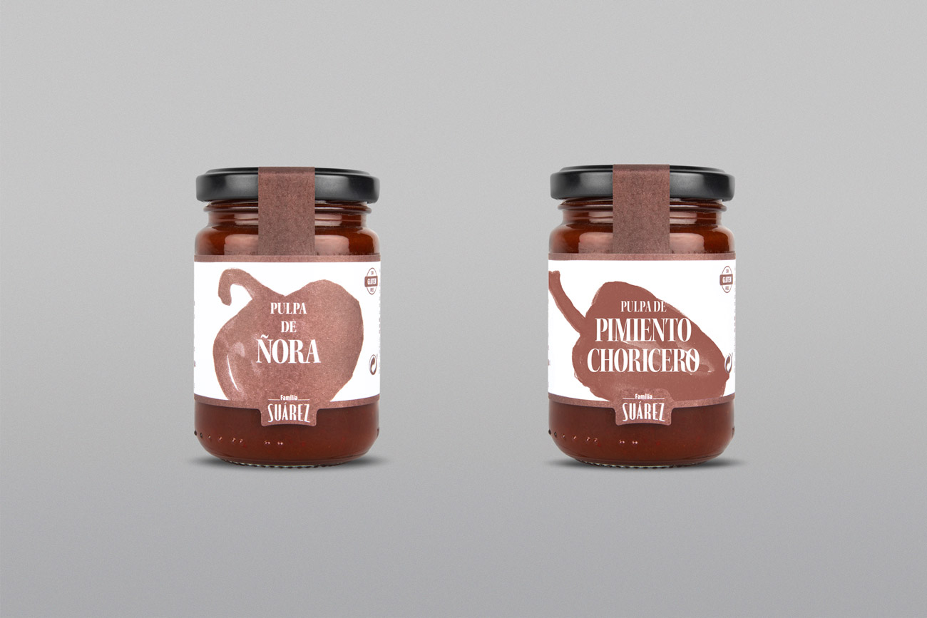
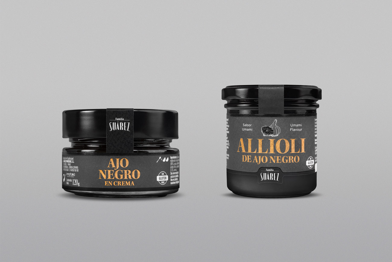
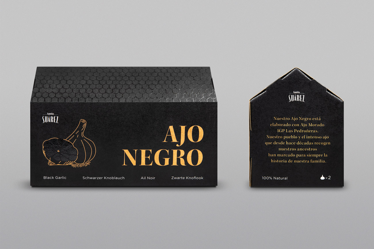
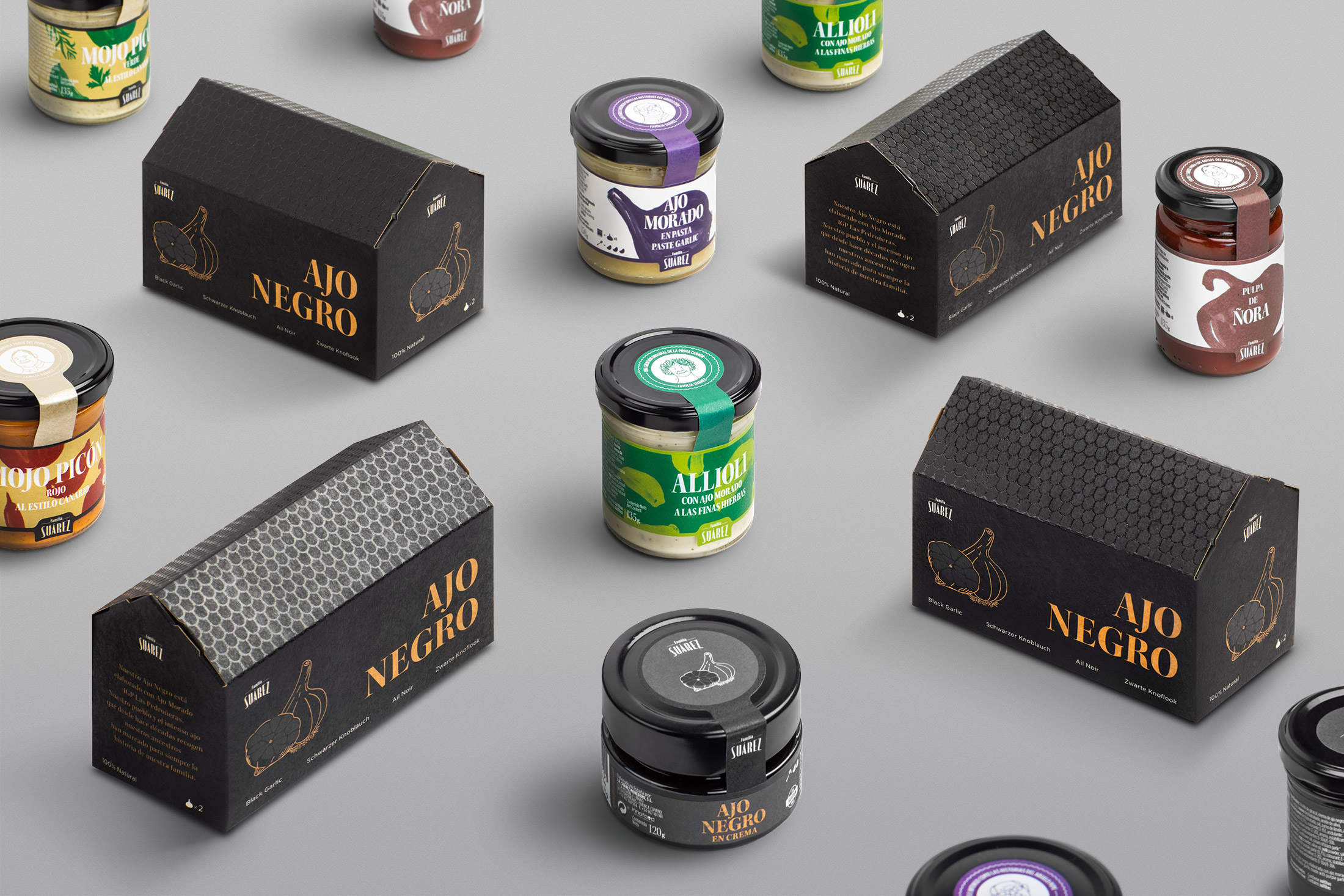
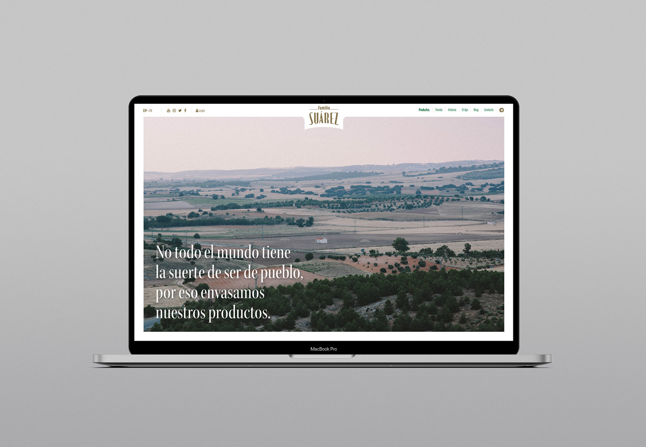
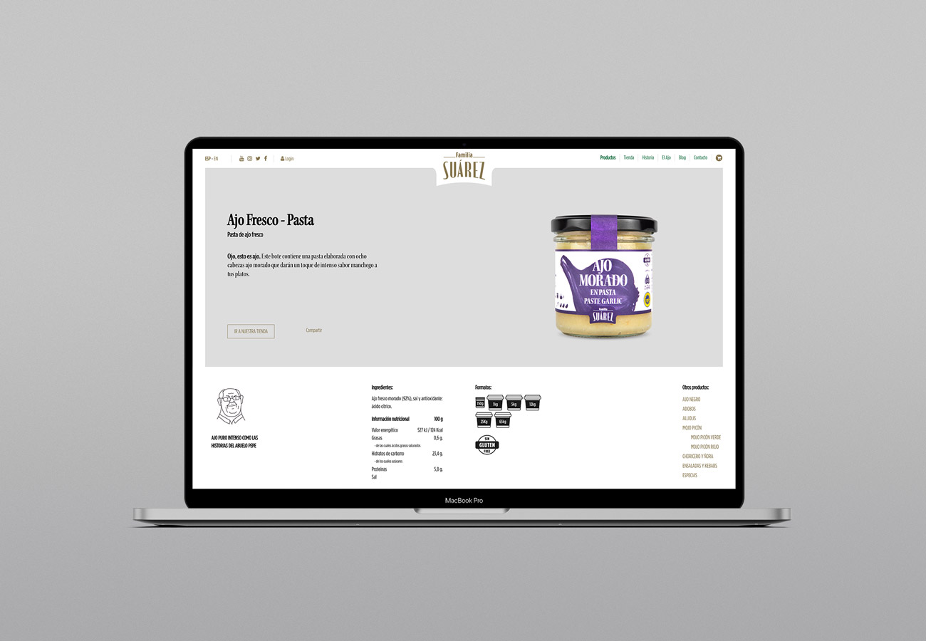
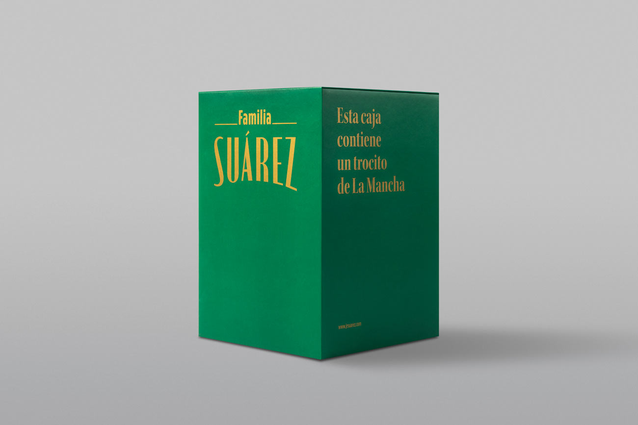
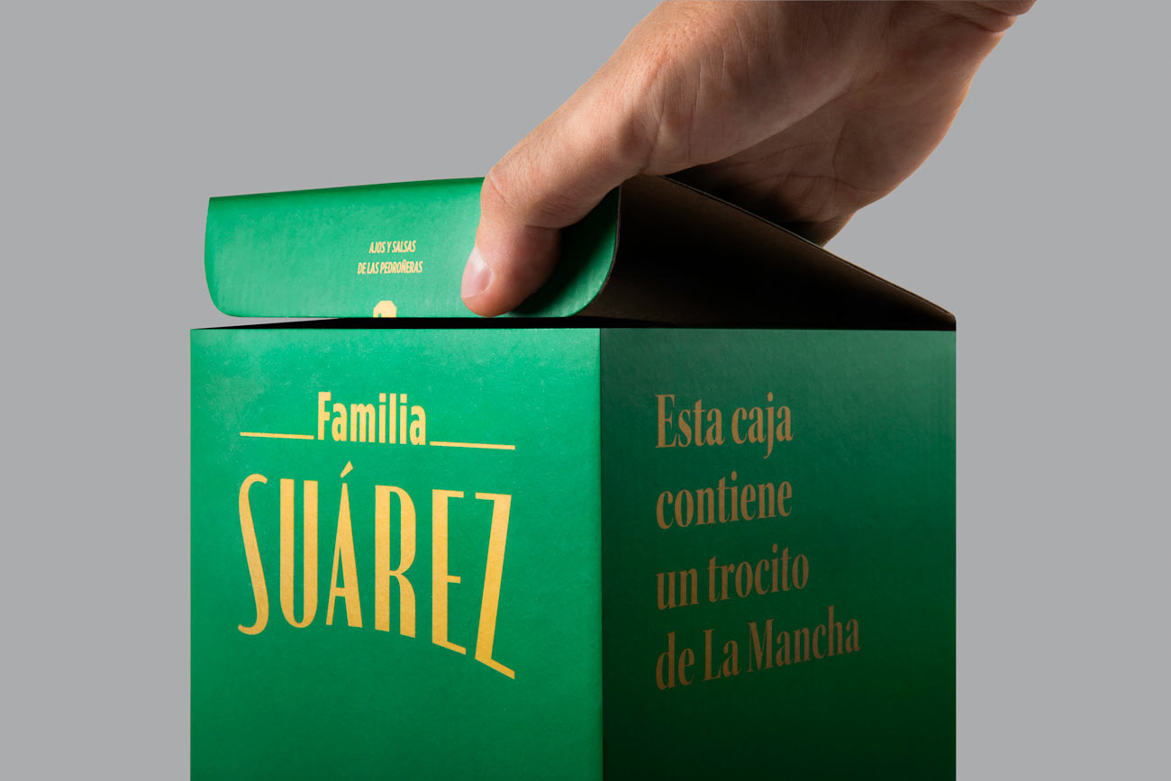
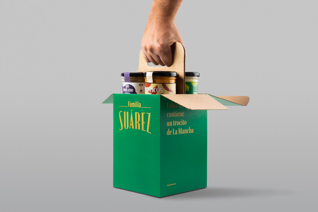
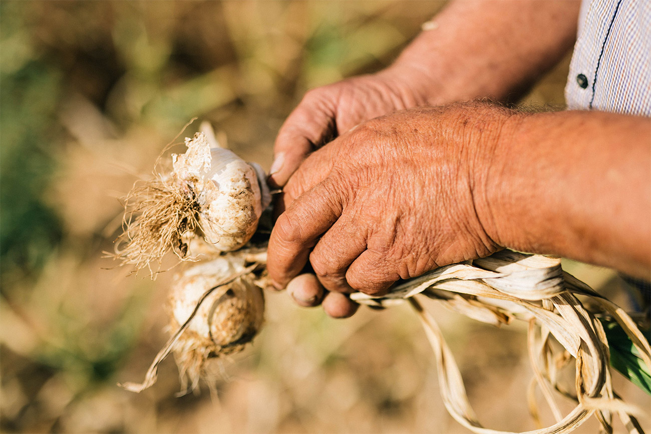
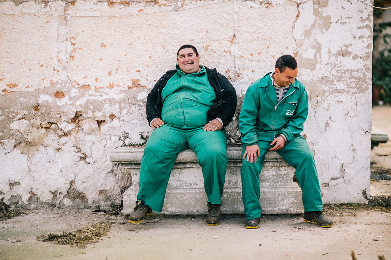
Honesty as a flag. A people’s brand that claims the people. This project is reunited with the authentic in a world of brands that try to be what they are not. JR Suárez is a family business located in Las Pedroñeras, the birthplace of the best garlic in Spain, Manchego garlic par excellence. How to make the real value of the brand visible?