Auvasa
ClientAUVASA
Movasa
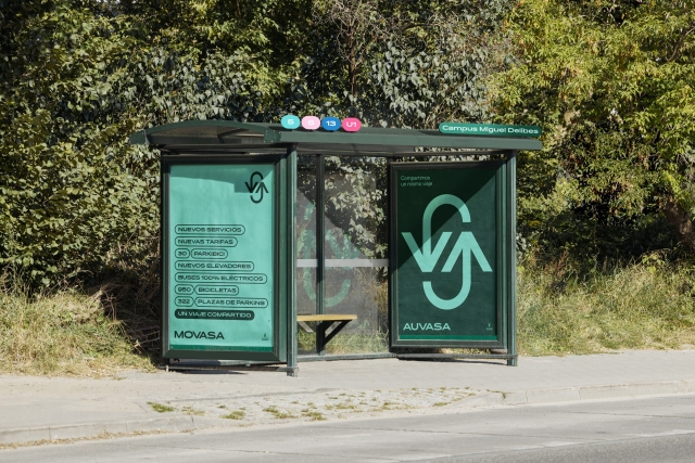
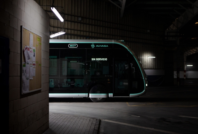
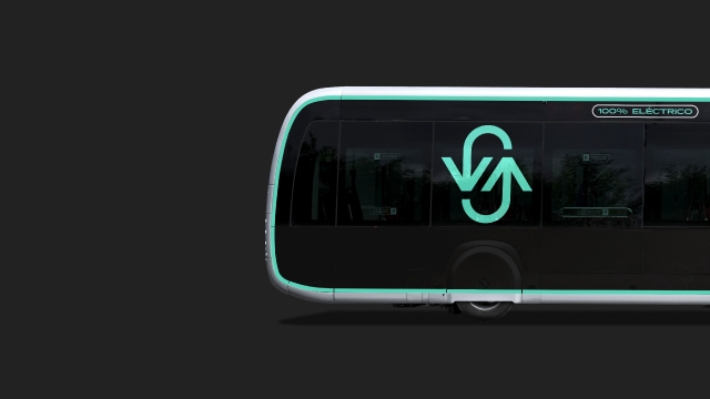
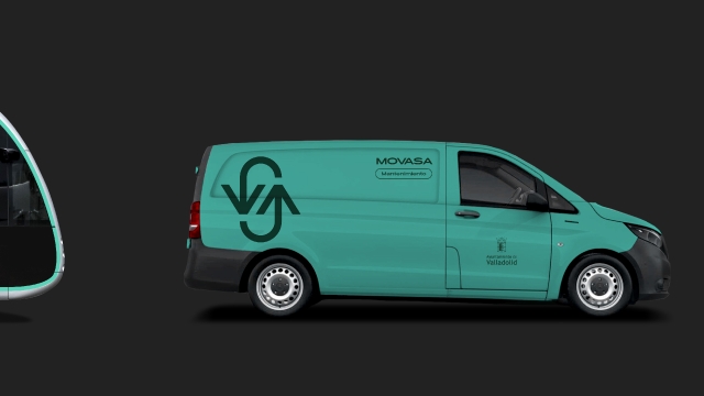
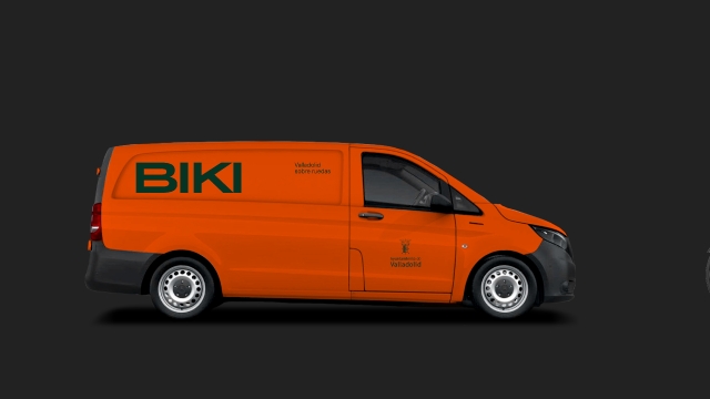
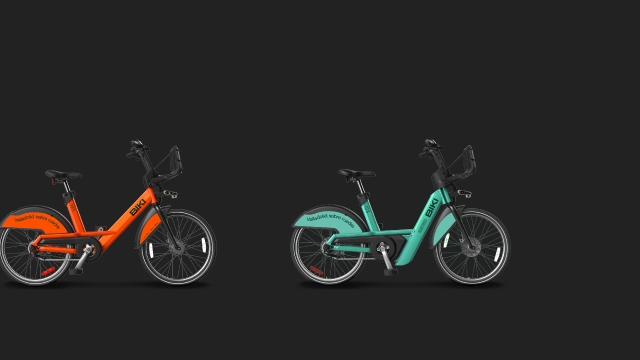
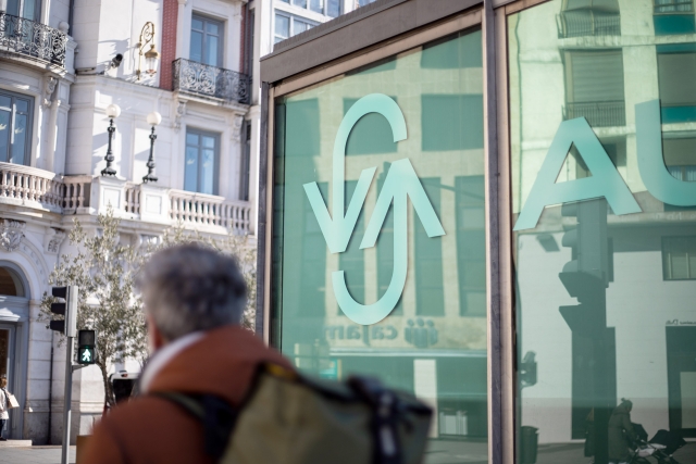
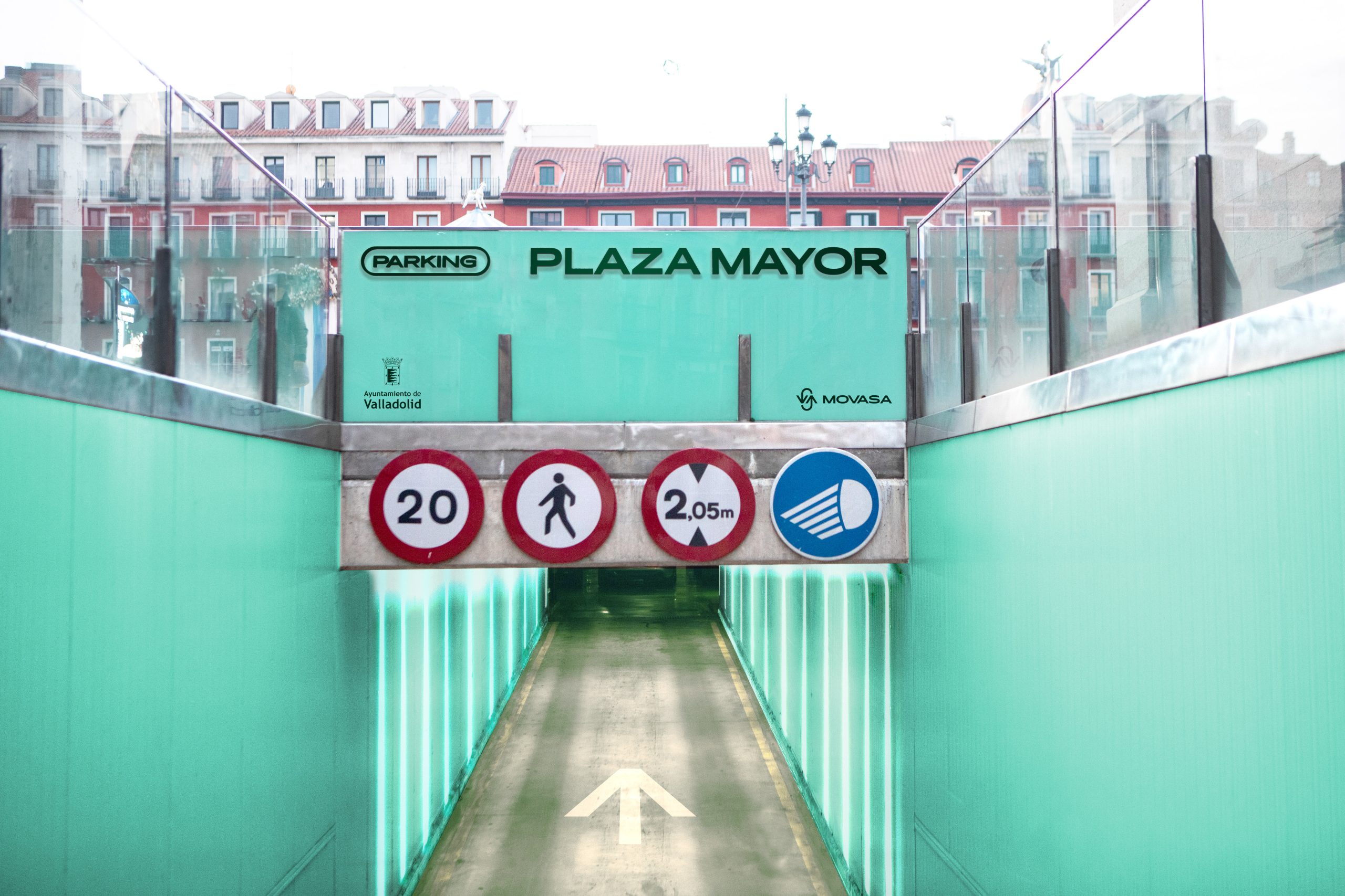
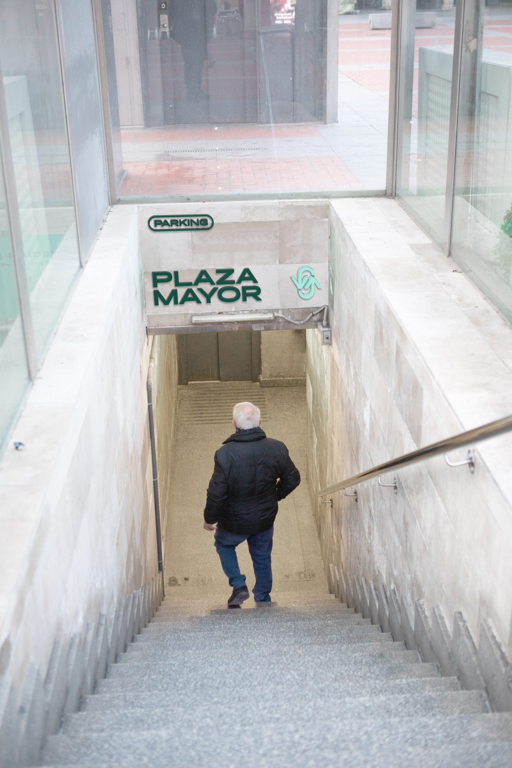
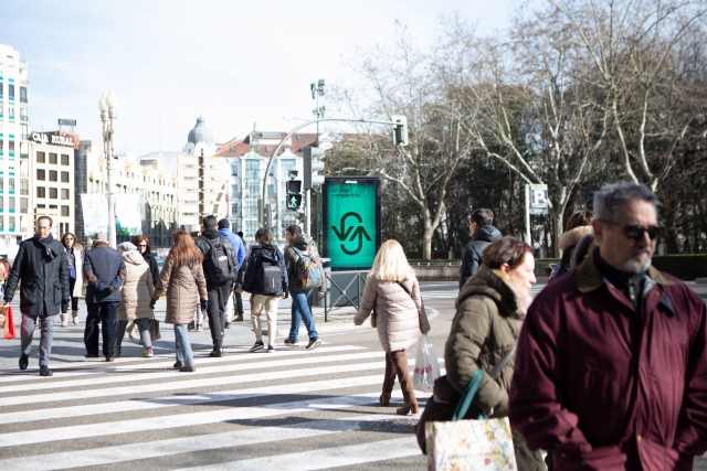
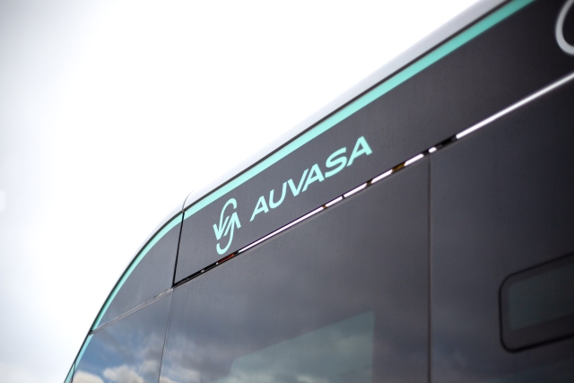
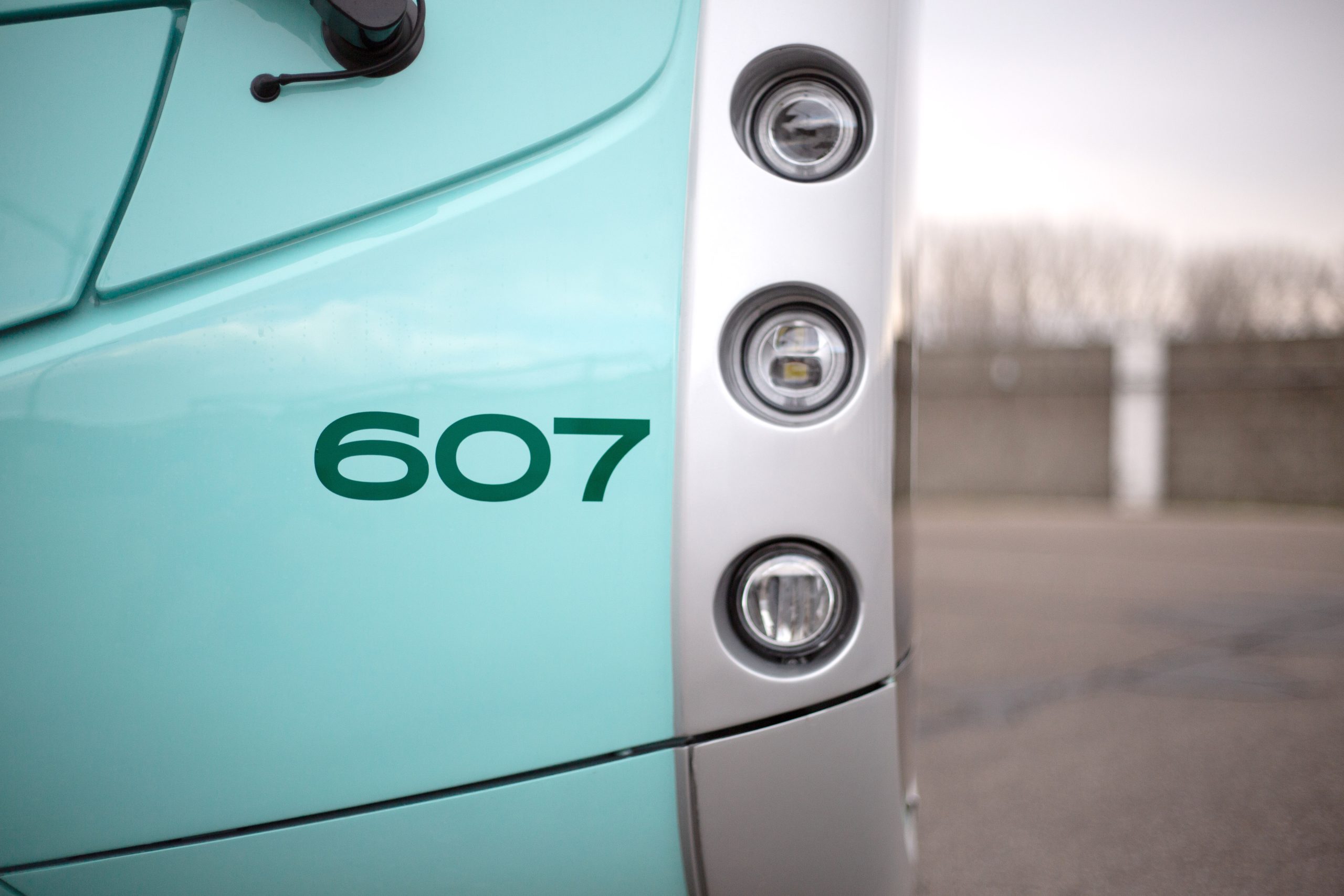
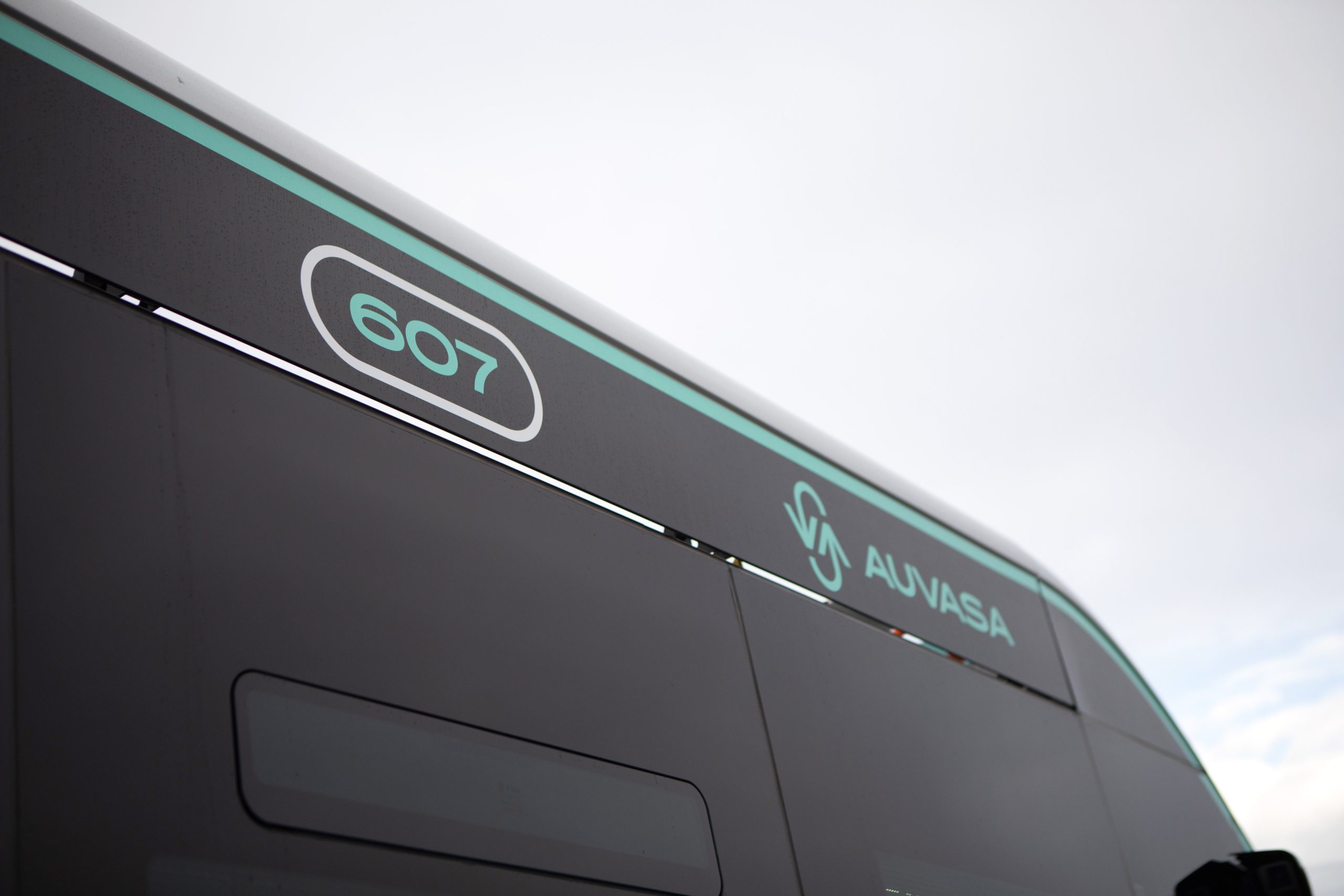
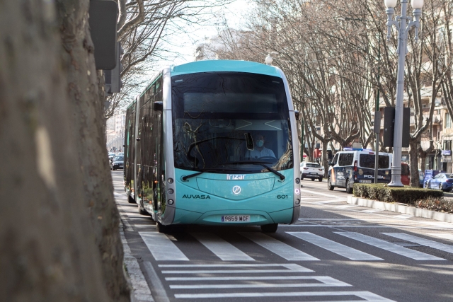
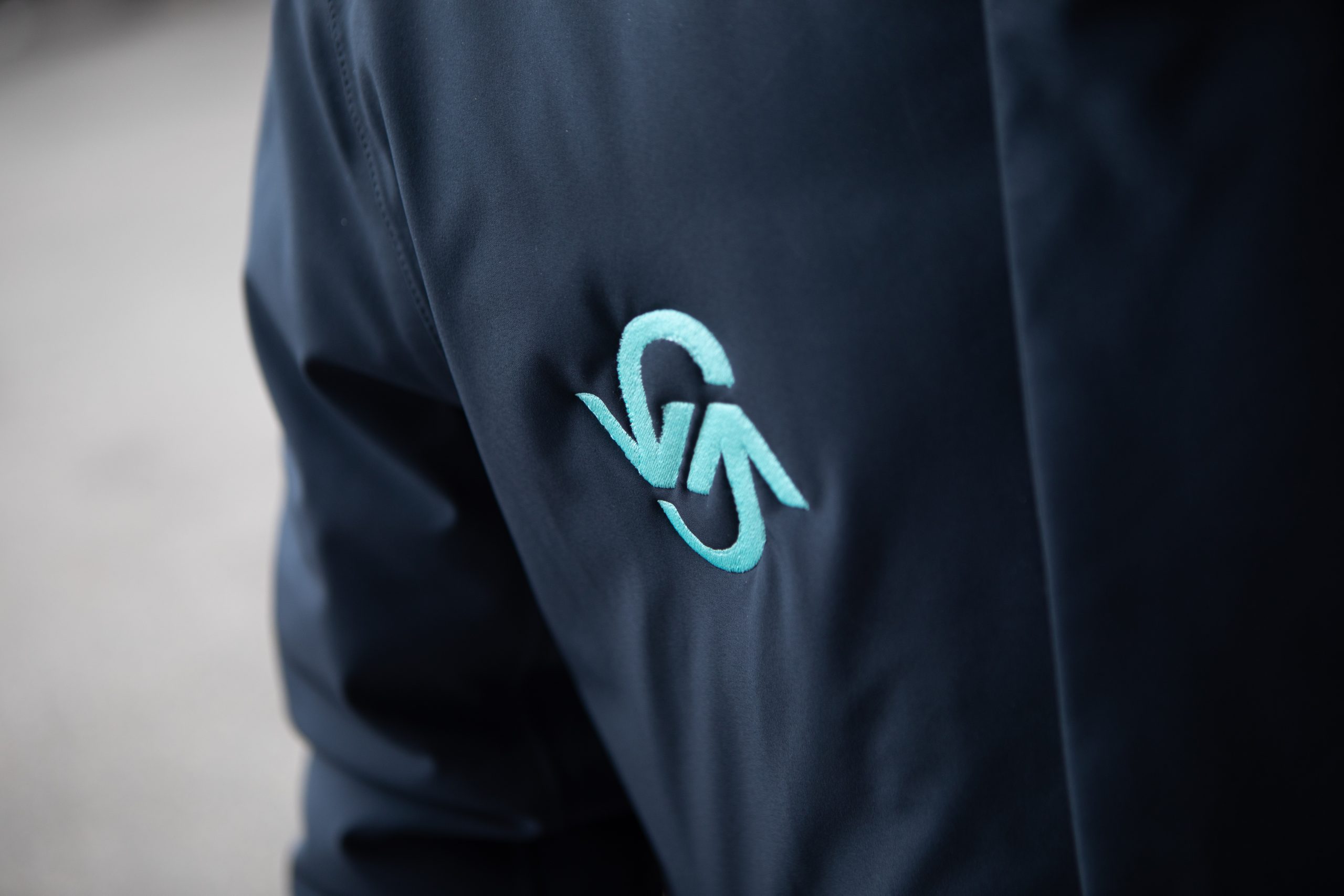
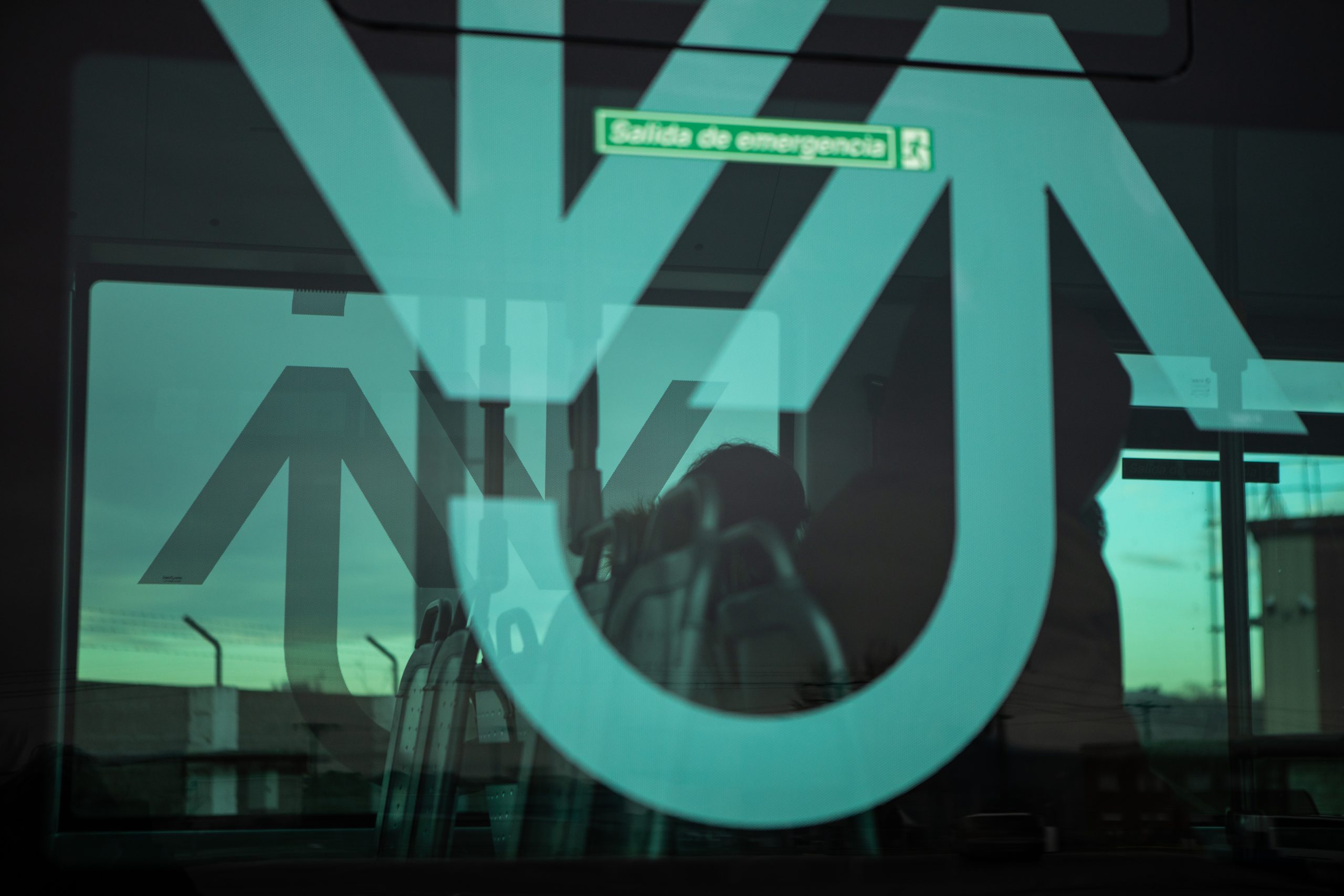
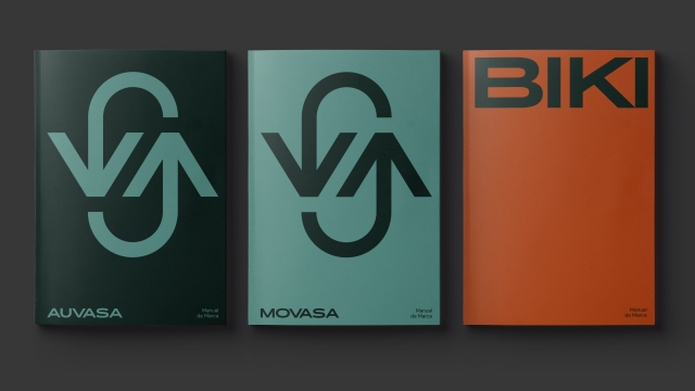
Idea Local mobility brands have the ability to transcend into city icons, becoming part of its idiosyncrasy. We cannot imagine London without its red buses, or New York without its subway entrances. With this premise, and due to a profound change in the mobility of the city of Valladolid, its beloved and popular municipal bus company is updating and transforming into the epicenter of all new mobility services. This involves a reorganization of the brand architecture, which, after a process of reflection and analysis, results in a parent brand that encompasses all mobility services: MOVASA, and the continuation of the traditional brand: AUVASA, for the municipal bus service. Similarly, other brands are developed for specific services, such as BIKI, for the public bicycle rental service, or PARKIBICI for public bicycle parking facilities distributed throughout the city. All this is under new color and visual codes that flood a greener city.


TYPEFACE
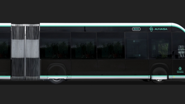
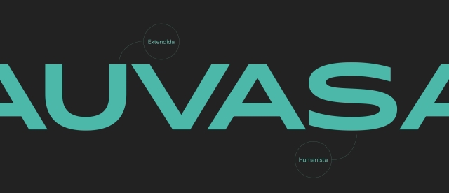
The identity is defined through two contrasting type families. The first is Pano Typeface from Heavyweight Foundry, serving as the primary typeface. It is an extended humanist typeface that fits perfectly on horizontal mediums, such as vehicles.
The second is DM Sans from Google Fonts, which serves as the secondary typeface. It has a more neutral character, greater legibility, and an open and free license for more accessible and affordable use.
ICON SYSTEM
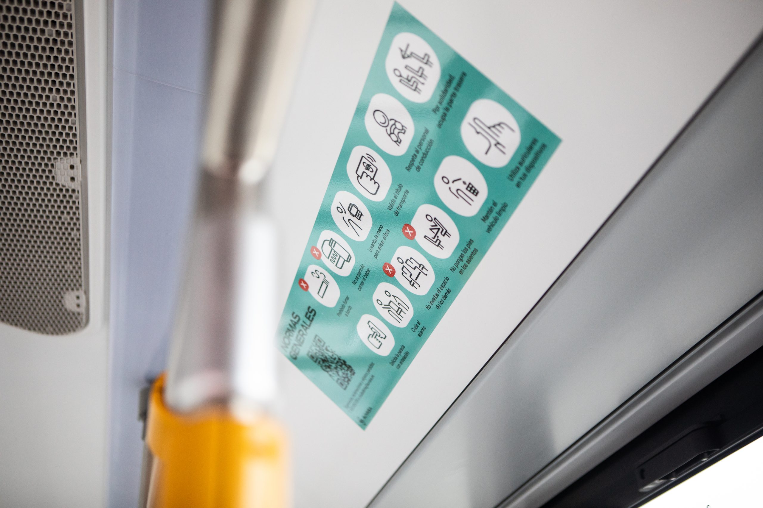
The icon system simplifies and streamlines communication, thereby improving the user experience of a service with so many touchpoints.
A visual language that enables the development of future signage under the visual parameters of the identity, through pure and grid-based geometries.
