Project

Murcia Fair

Client Ayuntamiento de Murcia

CONTEXT

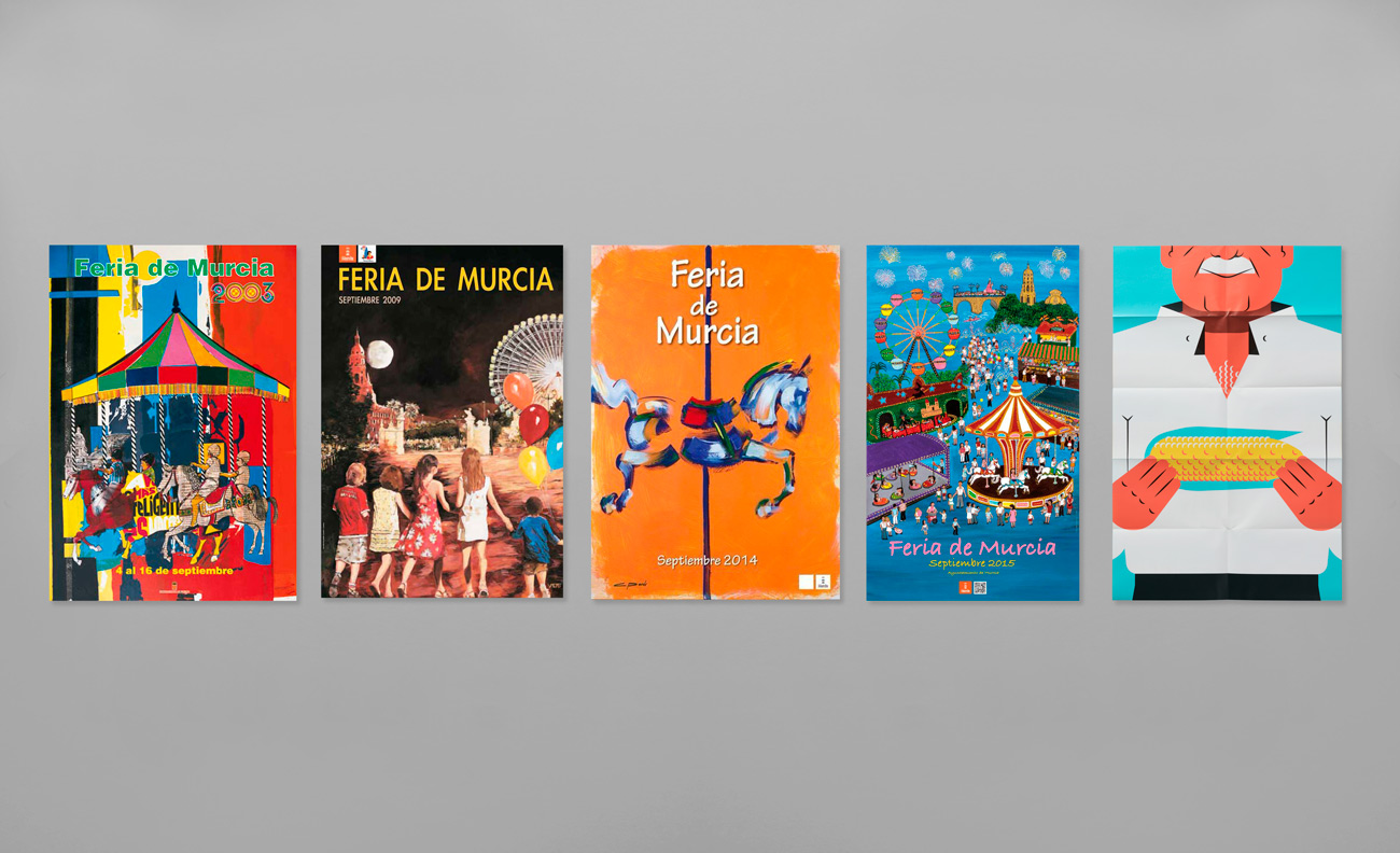
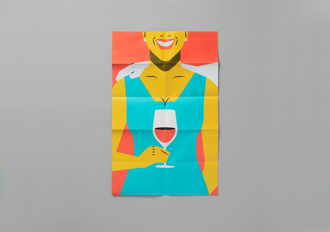
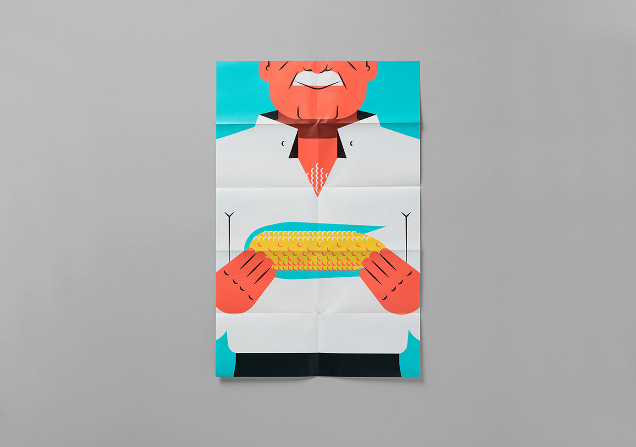
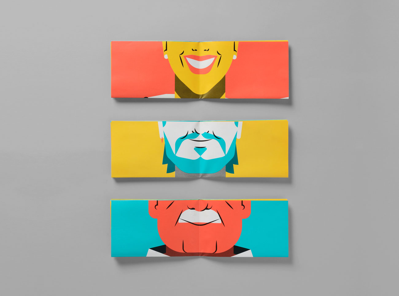
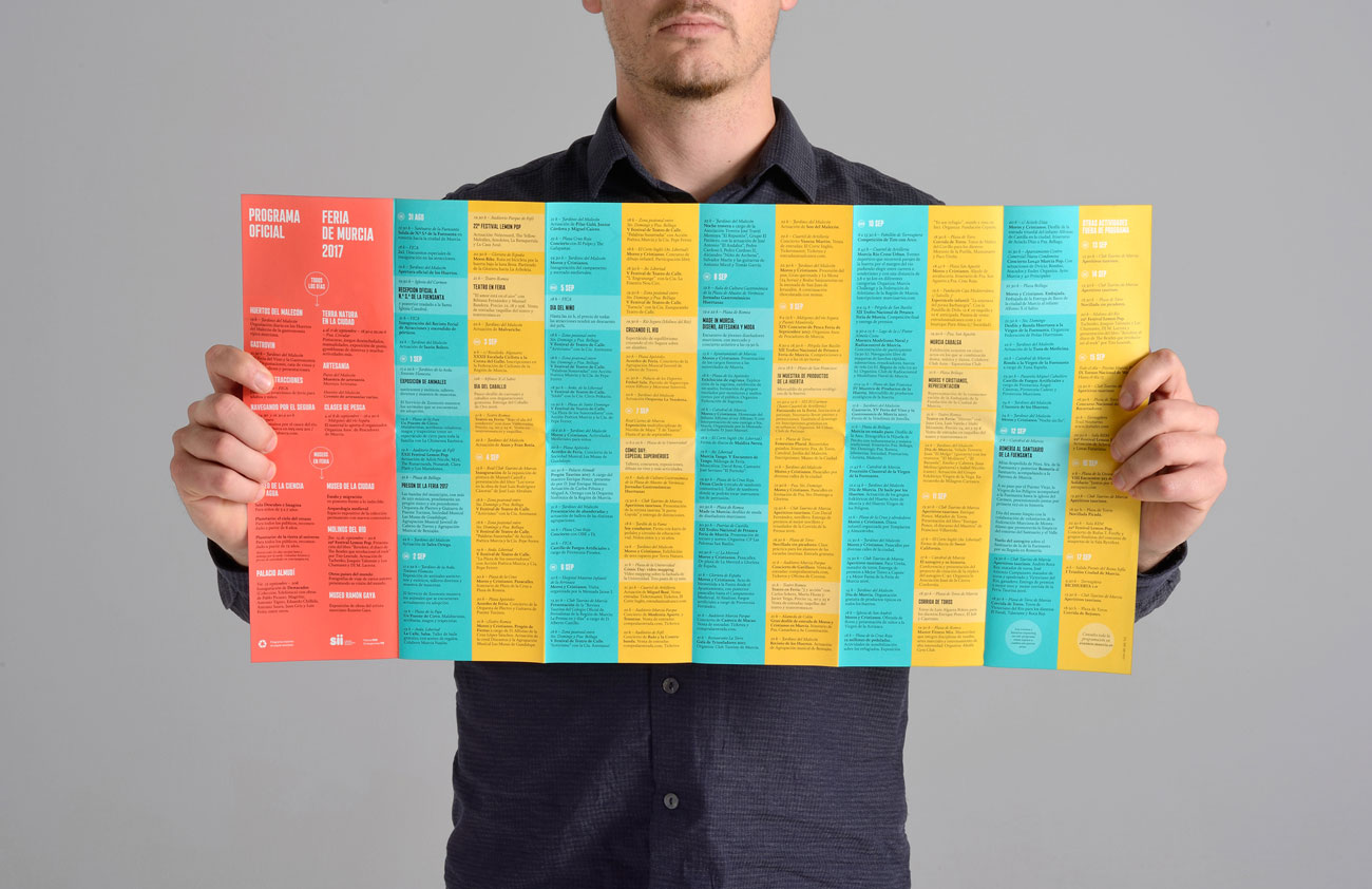
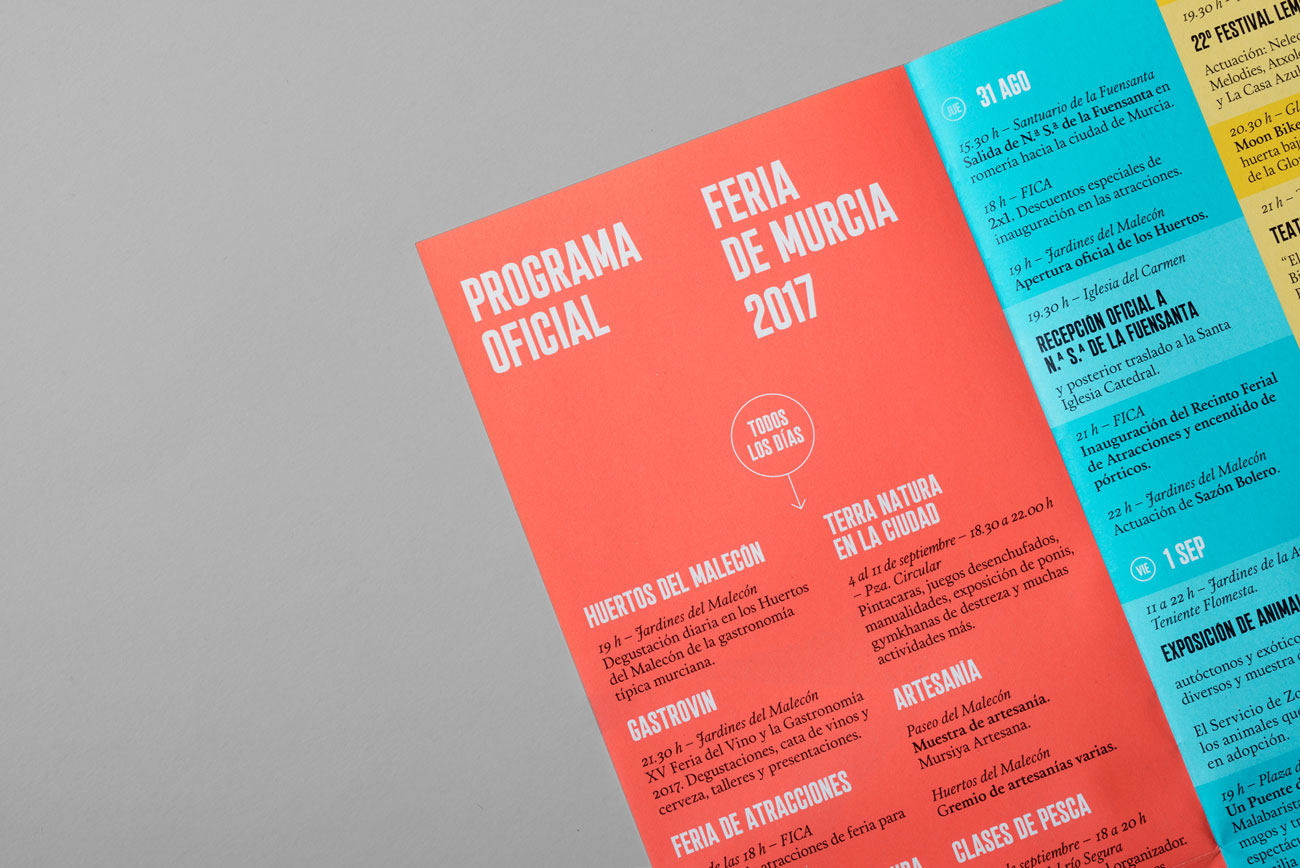
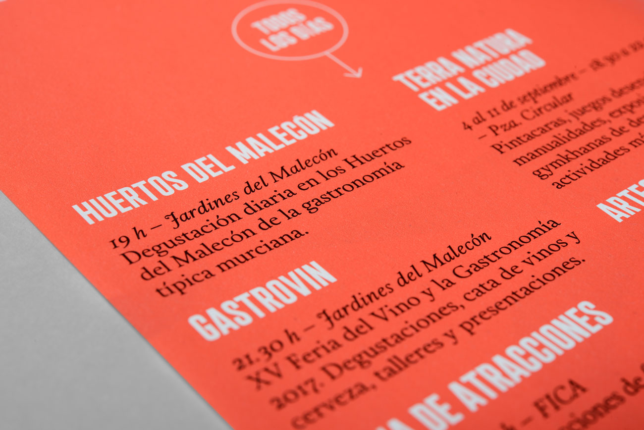
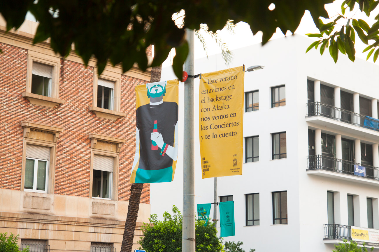
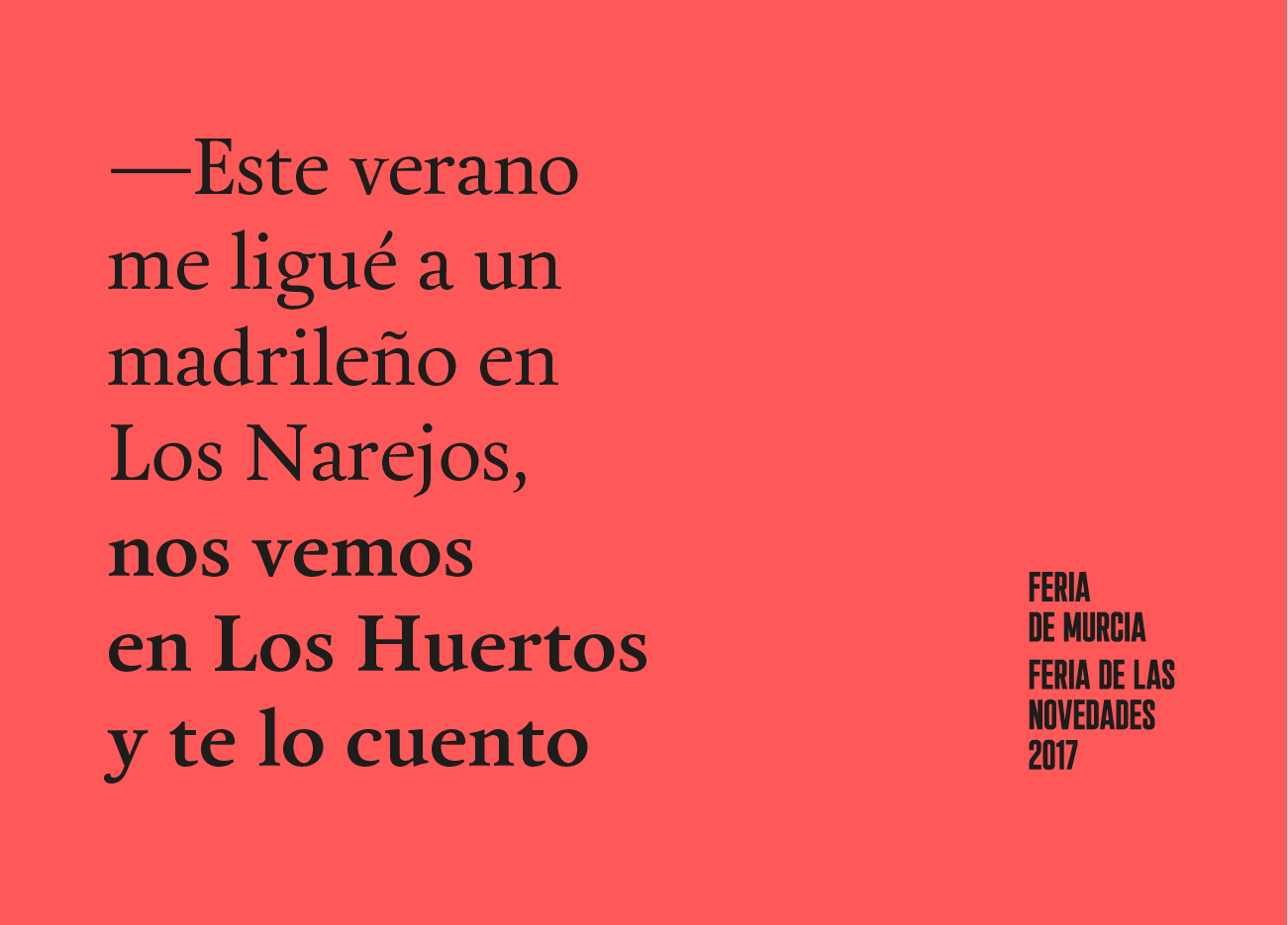
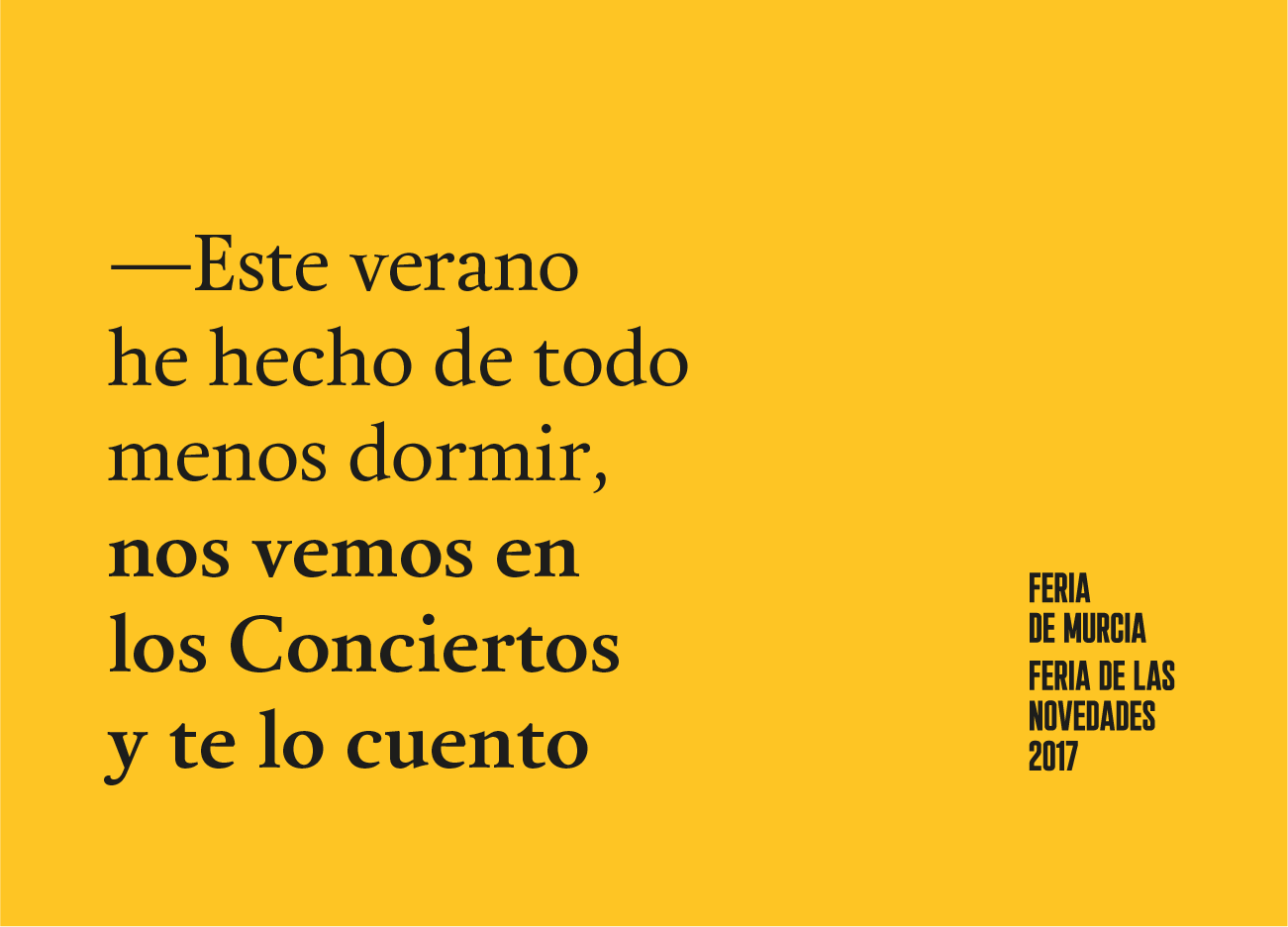
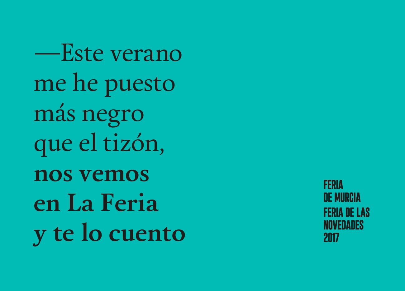
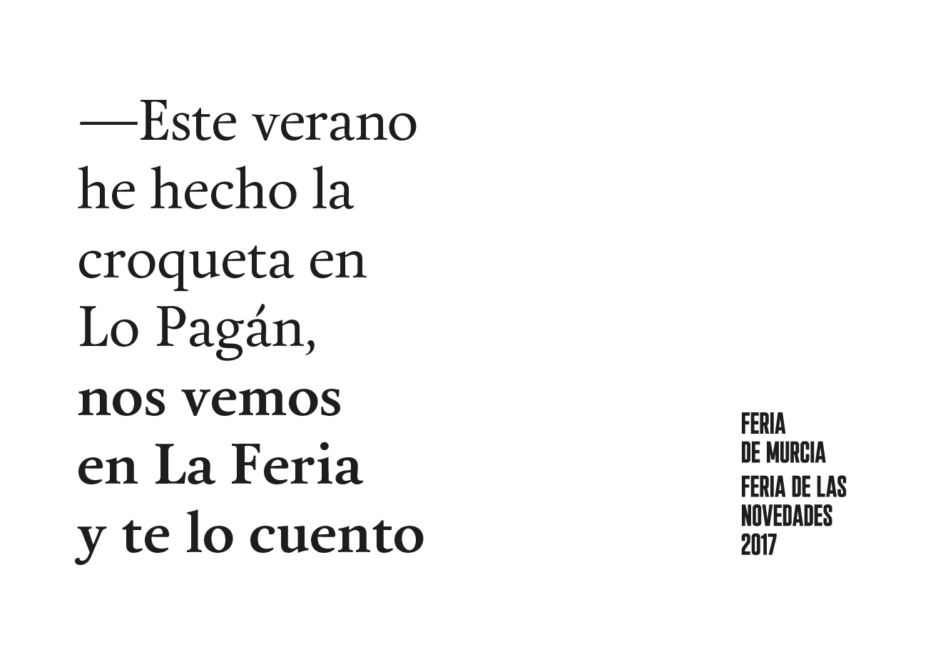
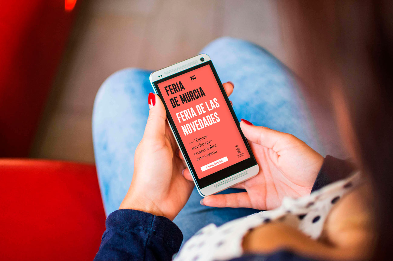
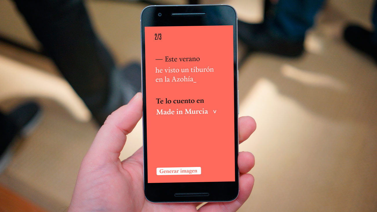
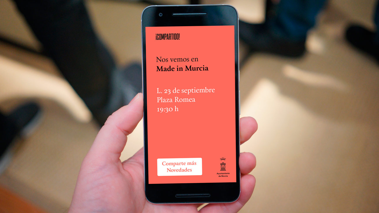
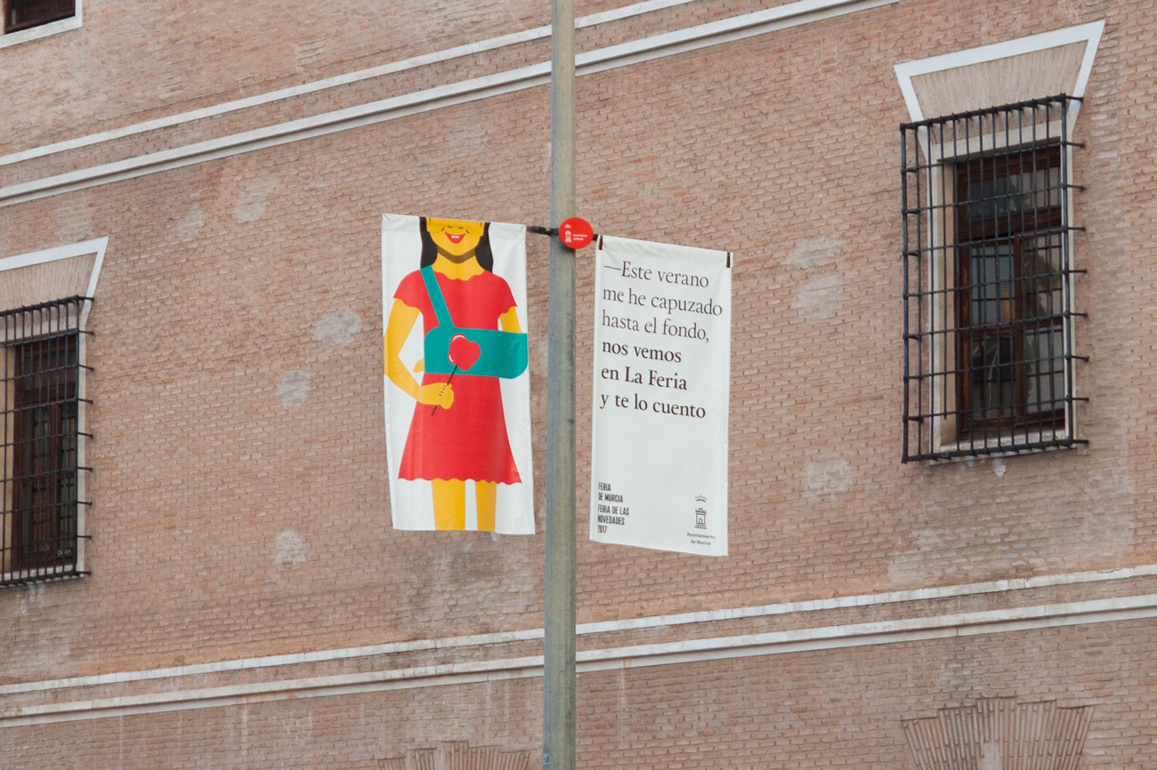
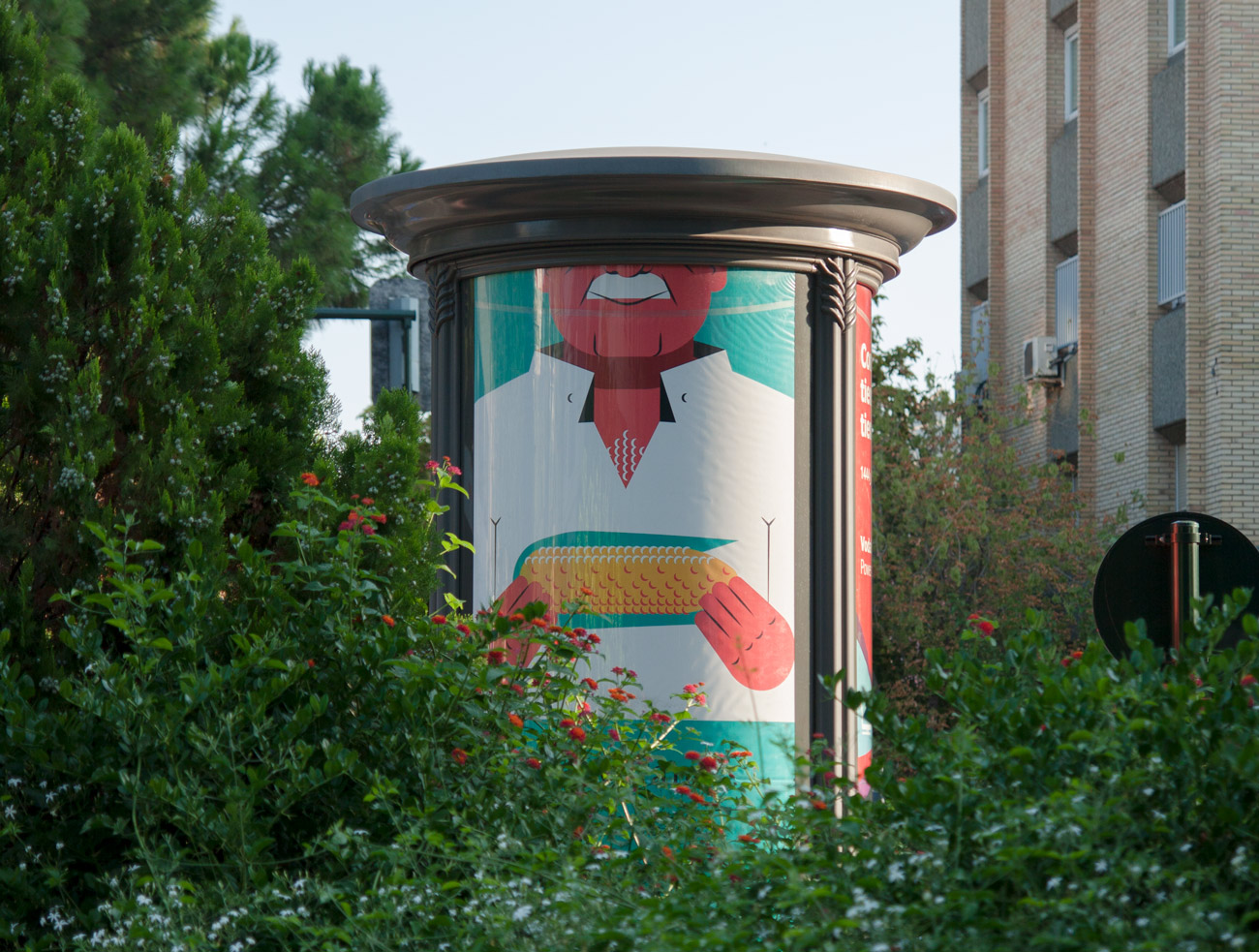
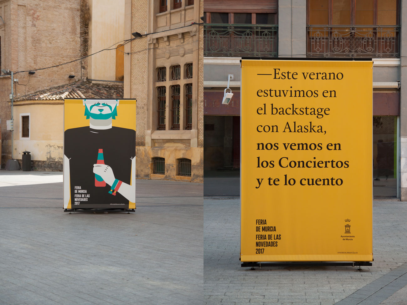
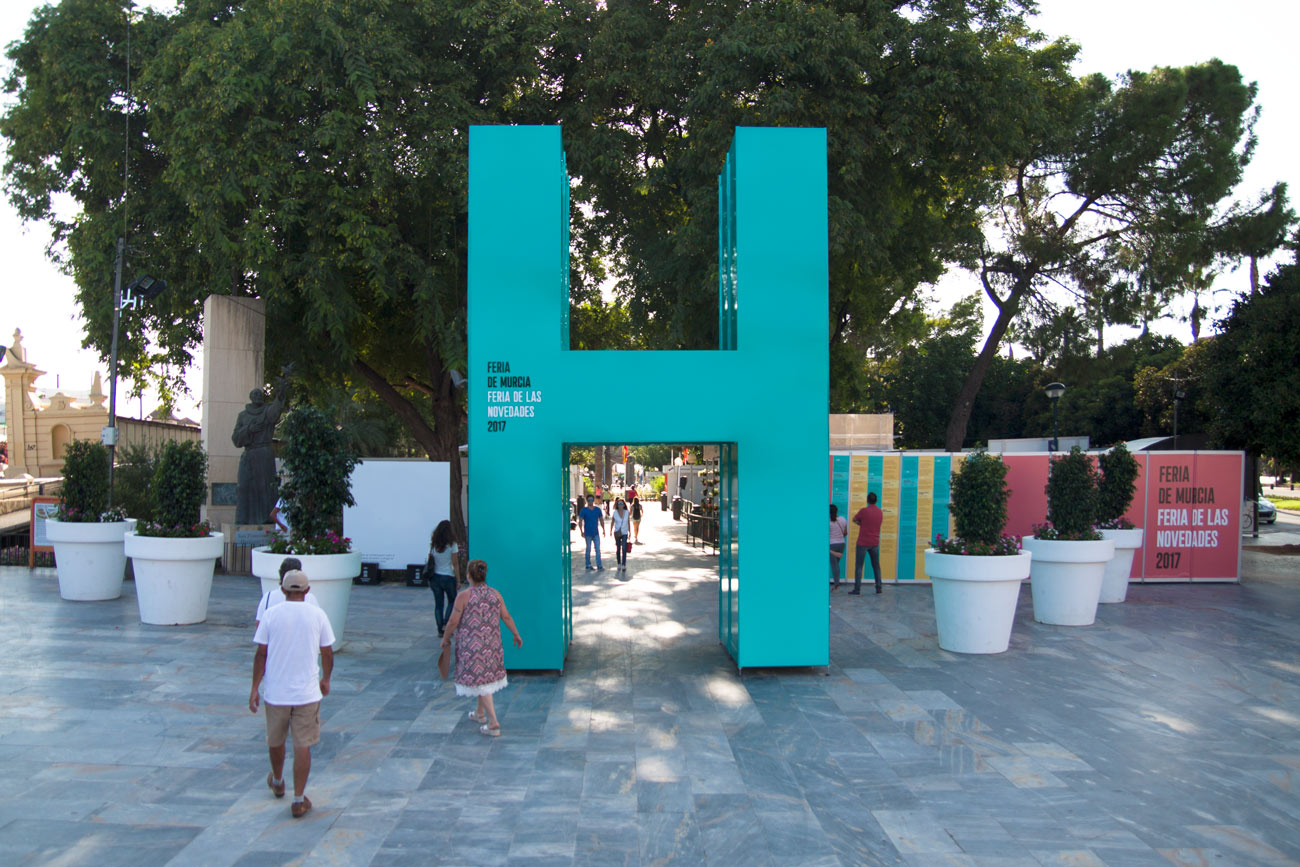
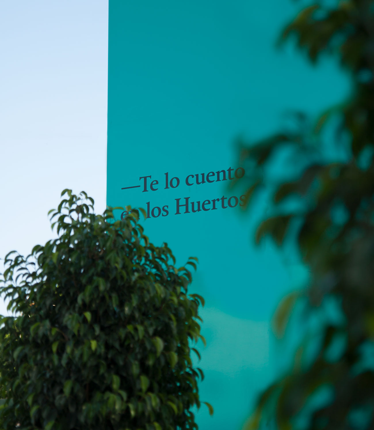
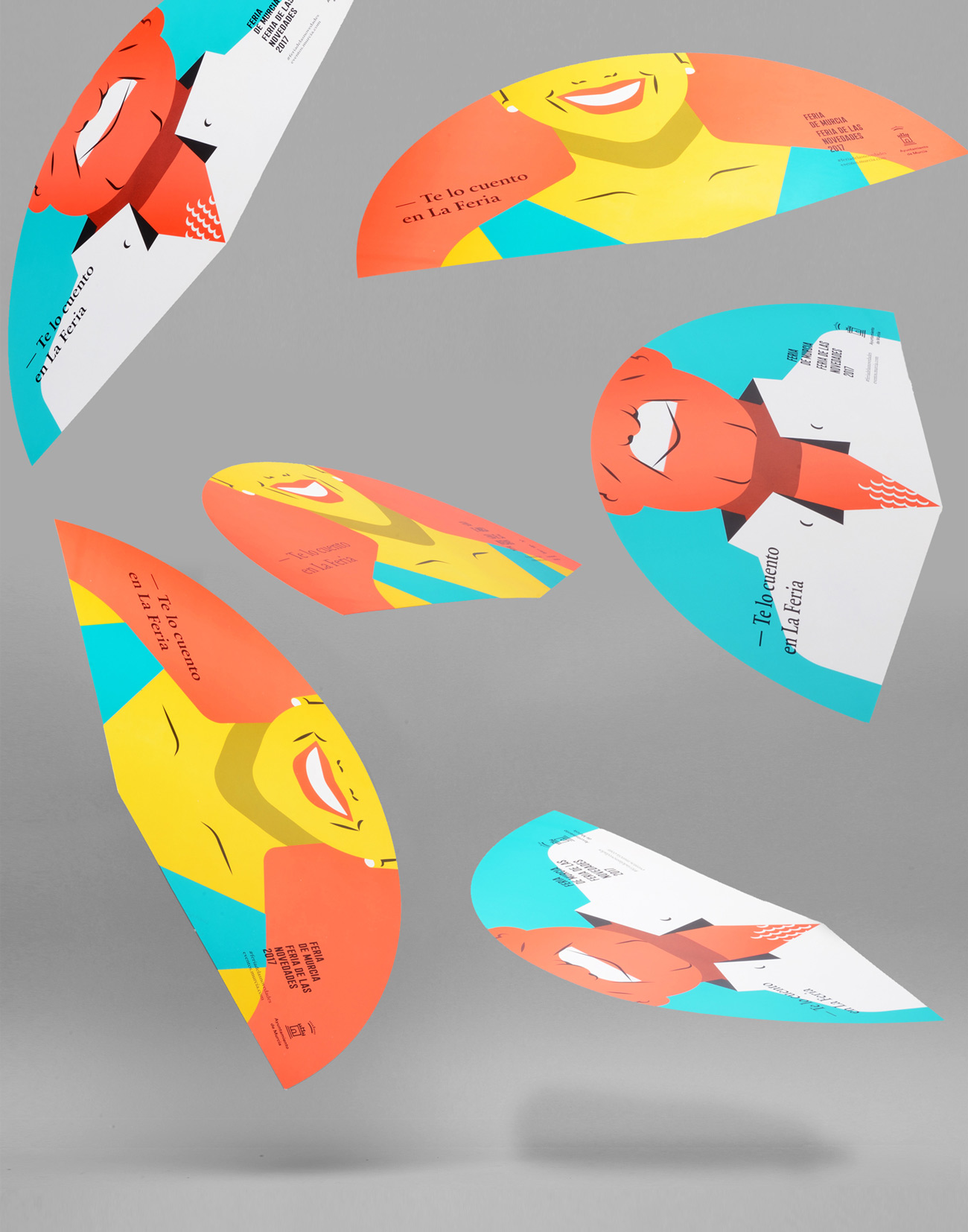
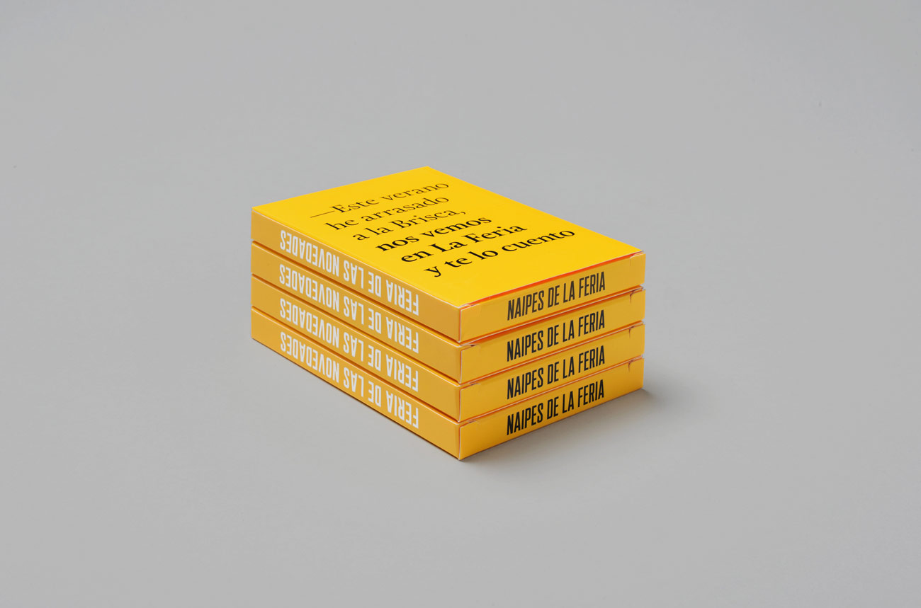
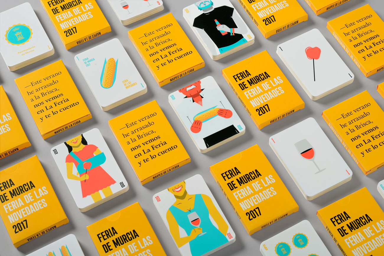
After several decades of pictorial commissions from local artists for the Murcia Fair poster, for the first time in a long time the commission fell to a design studio. Without going into assessing the artistic quality of these previous commissions, what has been palpable during this period is the lack of graphic coexistence between typography and these works. Our proposal, from the beginning, was aimed at solving a dynamic and flexible graphic instead of a rigid and unadaptable sign.


IDEA

Beyond technical issues, our purpose was to find the particularity of a festival that brings together events of all kinds, from folklore to sport, from tradition to innovation, from a Pilgrimage to the Virgen de la Fuensanta, to a fashion show. latest trends. This led us to look for a surrounding path capable of representing the singularity of some festivities without singularity:

a Fair of the News , not so much for what the program holds, but what really gives them meaning as a meeting point after a long summer. These festivities are held in September and their events are perfect excuses to tell your loved ones what the holidays have brought.

DEVELOPING

The graphic, familiar and colorful, presents four Murcian characters who identify themselves with different profiles that are very common in these festivities, all of them under a type of synthesized and direct illustration, in which representative objects of the different activities that make up the Fair are involved: a corn kernel, a caramel apple, a beer or a wine. The three colors used for the illustrations alternate in the characters, generating different meanings but maintaining a clear unity.

THE FAIR
IN AN APP

The September Fair is that place of reunion after the summer where you tell yourself what you have done, who you have met or what is the most significant thing that has happened to you on vacation. The entire campaign revolves around the idea of ​​the local citizen as the central axis, as the protagonist, it is about involving them, but not only with the copies developed in the printed pieces.

That is why we launched a web-app where each person can generate an image with their summer anecdote and choose one of the events of the program that, linked to the phrase, becomes a message to meet at La Feria.

MORE THAN 200
GRAPHIC PIECES

The campaign is articulated on several fronts, combining printed pieces with foreign media, television, radio, Internet and the press. Compared to the posters proposed in previous years, it is the first time in several decades that a tailor-made development of each of the graphic and audiovisual pieces is made by the same work team.

This is where graphics grows and demonstrates its adaptability to formats as diverse as aerial advertising, billboards, promotional pieces or radio spots.

Maintaining the graphic unit, the symbolic entrance to the “Los Huertos” fairgrounds became a giant “H” whose hole served as an access portico.

POPULAR
CHARACTER

Different promotional pieces were also developed, such as fans, ideal for the high temperatures in the city on these dates. Among these pieces we highlight the design of a deck that recovers the spirit of other graphic pieces developed in the 80s as special gifts. The City Council makes this promotional gift to the first residents who come to pick up the festival program.

Our bet has been to turn the characters into something as summery as the figures of the “Murcian” deck, where the clubs were exchanged for ears, the gold for beer caps, the swords for caramel apples and the glasses for wine. You can see the full work here.