AEE Space Agency of Spain
ClientMinisterio de Ciencia e Innovación
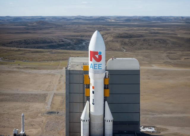
Idea A brand to internationally promote excellence in the field of innovation and space technology. A timeless symbol capable of representing a country outside and inside the planet, made hand in hand with the legendary Cruz más Cruz design studio.
A large red arrow coming out of a small blue sphere
There is not much more to explain about this simple metaphor of the effort that this public institution has to bring our color to space. A powerful and impetuous arrow, with a very thick stroke that contains all its contained energy. Making something big is as simple as putting something small next to it. The world is just an azure blue dot in deep space. But our project, our company, our ambition can be as great as imagination and science allow us. Our drive makes us go beyond the small and make our presence in space great.
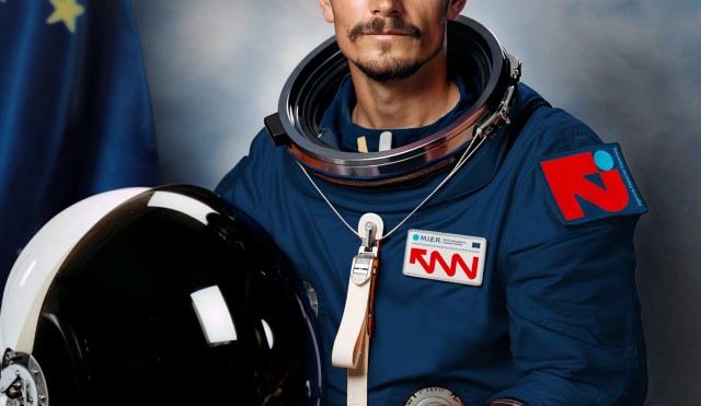
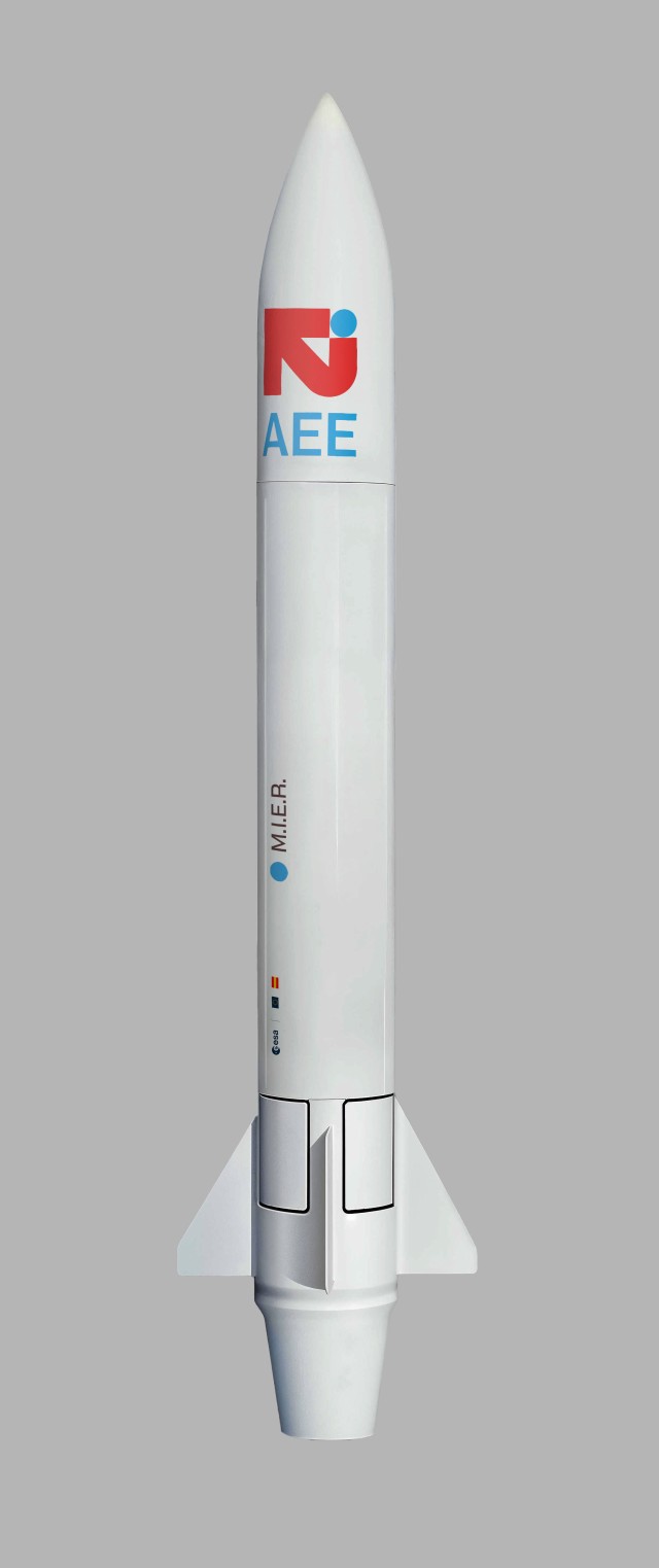
Belonging and differentiation, the balance for efficient positioning
Observing the context where this brand is going to work, we see that it is not difficult to identify a standard very marked by NASA as a pioneer in this field. The orbit, the rocket and a sphere as the predominant geometry. Three elements that very few brands shy away from. When we put two of them together, the kinship is evident, if we put three together we obtain emulations incapable of providing singularity. This leaves brands in a herd position that we try to avoid at all costs. The solution seeks its own language that preserves a sectoral identification through color and seeks a difference through discourse, symbology and form.
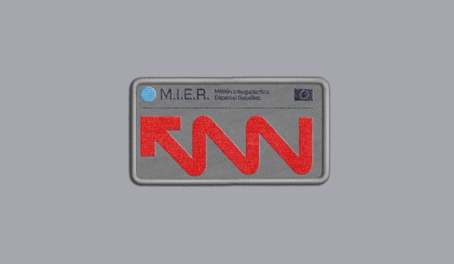
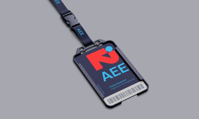
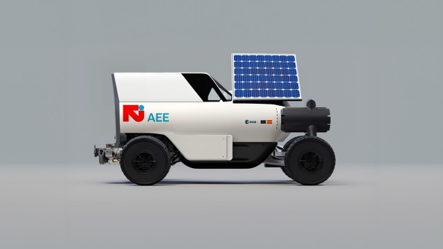
A brand capable of adapting to diverse contexts in which a simple logo can be constrained. Color, typography, the circle or the arrow become the backbone elements of a dynamic language specially designed to work on the screen without losing performance in other applications such as uniforms or identifiers.
Beyond the logo
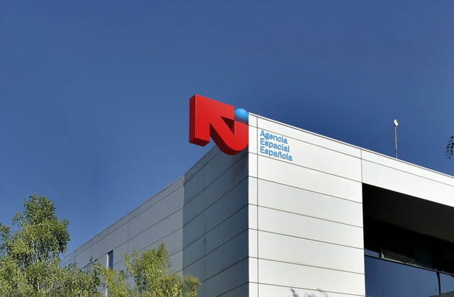
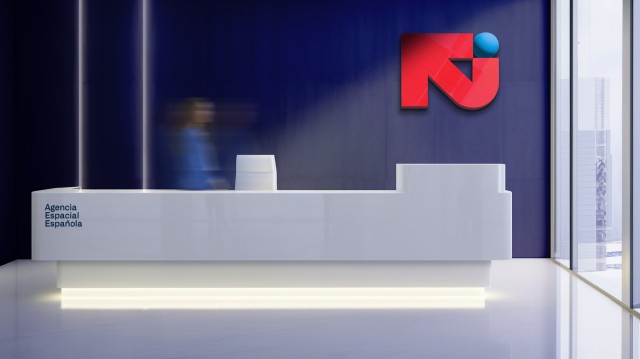
A technical and resounding tone. Supported by a typography that flees from futurism of the past to provide a technicality of the present. An ambivalent tone capable of functioning, in a timeless manner, in the field of defense and science.
But in design, one plus one does not always equal two and it is exciting to propose second readings to the interlocutor that, although they are not decisive for understanding the brand, provide something extra capable of generating a bond as a result of the discovery. The one with our most unique letter, the “Ñ”. The voice of a country condensed into a single character.
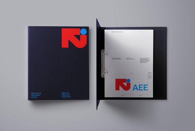
A powerful, simple and strong brand with elements linked to our country and the Agency’s scope of action. A metaphor for everything we can do in space but above all for the effort to achieve it.
